flutter开发实战-可扩展popup弹窗template模版样式
最近在看到一个flutter_beautiful_popup,可以美化弹窗窗口样式。该插件通过一个template模版的类BeautifulPopupTemplate作为抽象的base类。

一、基类BeautifulPopupTemplate
在BeautifulPopupTemplate中,BeautifulPopupTemplate为抽象类。该类定义了get方法size、width、height、maxWidth、maxHeight、bodyMargin、illustrationPath、primaryColor、close、background、title、content、actions、button。
在一个popup中一般有标题title、内容content、操作的按钮、关闭按钮等,所以这个BeautifulPopupTemplate定义了这些内容。
BeautifulPopupTemplate需要传递一个BeautifulPopup,该类中包括了BeautifulPopupTemplate需要的context、_illustration等。
BeautifulPopupTemplate代码如下
import 'package:flutter/material.dart';
import '../flutter_component_beautiful_popup.dart';
import 'dart:ui' as ui;
import 'package:auto_size_text/auto_size_text.dart';

typedef Widget BeautifulPopupButton({
  required String label,
  required void Function() onPressed,
  TextStyle labelStyle,
  bool outline,
  bool flat,
});

/// You can extend this class to custom your own template.
abstract class BeautifulPopupTemplate extends StatefulWidget {
  final BeautifulPopup options;
  BeautifulPopupTemplate(this.options);

  final State<StatefulWidget> state = BeautifulPopupTemplateState();

  @override
  State<StatefulWidget> createState() => state;

  Size get size {
    double screenWidth = MediaQuery.of(options.context).size.width;
    double screenHeight = MediaQuery.of(options.context).size.height;
    double height = screenHeight > maxHeight ? maxHeight : screenHeight;
    double width;
    height = height - bodyMargin * 2;
    if ((screenHeight - height) < 140) {
      // For keep close button visible
      height = screenHeight - 140;
      width = height / maxHeight * maxWidth;
    } else {
      if (screenWidth > maxWidth) {
        width = maxWidth - bodyMargin * 2;
      } else {
        width = screenWidth - bodyMargin * 2;
      }
      height = width / maxWidth * maxHeight;
    }
    return Size(width, height);
  }

  double get width => size.width;
  double get height => size.height;

  double get maxWidth;
  double get maxHeight;
  double get bodyMargin;

  /// The path of the illustration asset.
  String get illustrationPath => '';
  String get illustrationKey =>
      'packages/flutter_component_beautiful_popup/$illustrationPath';
  Color get primaryColor;

  double percentW(double n) {
    return width * n / 100;
  }

  double percentH(double n) {
    return height * n / 100;
  }

  Widget get close {
    return MaterialButton(
      shape: RoundedRectangleBorder(borderRadius: BorderRadius.circular(100)),
      splashColor: Colors.transparent,
      hoverColor: Colors.transparent,
      minWidth: 45,
      height: 45,
      child: Container(
        padding: EdgeInsets.all(20),
        child: Icon(Icons.close, color: Colors.white70, size: 26),
      ),
      padding: EdgeInsets.all(0),
      onPressed: Navigator.of(options.context).pop,
    );
  }

  Widget get background {
    final illustration = options.illustration;
    return illustration == null
        ? Image.asset(
            illustrationKey,
            width: percentW(100),
            height: percentH(100),
            fit: BoxFit.fill,
          )
        : CustomPaint(
            size: Size(percentW(100), percentH(100)),
            painter: ImageEditor(
              image: illustration,
            ),
          );
  }

  Widget get title {
    if (options.title is Widget) {
      return Container(
        width: percentW(100),
        height: percentH(10),
        alignment: Alignment.center,
        child: options.title,
      );
    }
    return Container(
      alignment: Alignment.center,
      width: percentW(100),
      height: percentH(10),
      child: Opacity(
        opacity: 0.95,
        child: AutoSizeText(
          options.title,
          maxLines: 1,
          style: TextStyle(
            fontSize: Theme.of(options.context).textTheme.headline6?.fontSize,
            color: primaryColor,
            fontWeight: FontWeight.bold,
          ),
        ),
      ),
    );
  }

  Widget get content {
    return options.content is String
        ? AutoSizeText(
            options.content,
            minFontSize: 10,
            style: TextStyle(
              color: Colors.black87,
            ),
          )
        : options.content;
  }

  Widget? get actions {
    final actionsList = options.actions;
    if (actionsList == null || actionsList.length == 0) return null;
    return Flex(
      mainAxisAlignment: MainAxisAlignment.center,
      crossAxisAlignment: CrossAxisAlignment.center,
      mainAxisSize: MainAxisSize.max,
      direction: Axis.horizontal,
      children: actionsList
          .map(
            (button) => Flexible(
              flex: 1,
              child: Padding(
                padding: EdgeInsets.symmetric(horizontal: 5),
                child: button,
              ),
            ),
          )
          .toList(),
    );
  }

  BeautifulPopupButton get button {
    return ({
      required String label,
      required void Function() onPressed,
      bool outline = false,
      bool flat = false,
      TextStyle labelStyle = const TextStyle(),
    }) {
      final gradient = LinearGradient(colors: [
        primaryColor.withOpacity(0.5),
        primaryColor,
      ]);
      final double elevation = (outline || flat) ? 0 : 2;
      final labelColor =
          (outline || flat) ? primaryColor : Colors.white.withOpacity(0.95);
      final decoration = BoxDecoration(
        gradient: (outline || flat) ? null : gradient,
        borderRadius: BorderRadius.all(Radius.circular(80.0)),
        border: Border.all(
          color: outline ? primaryColor : Colors.transparent,
          width: (outline && !flat) ? 1 : 0,
        ),
      );
      final minHeight = 40.0 - (outline ? 2 : 0);
      return ElevatedButton(
        // color: Colors.transparent,
        // elevation: elevation,
        // highlightElevation: 0,
        // splashColor: Colors.transparent,
        child: Ink(
          decoration: decoration,
          child: Container(
            constraints: BoxConstraints(
              minWidth: 100,
              minHeight: minHeight,
            ),
            alignment: Alignment.center,
            child: Text(
              label,
              style: TextStyle(
                color: labelColor,
              ).merge(labelStyle),
            ),
          ),
        ),
        // padding: EdgeInsets.all(0),
        // shape: RoundedRectangleBorder(
        //   borderRadius: BorderRadius.circular(50),
        // ),
        onPressed: onPressed,
      );
    };
  }

  List<Positioned> get layout;
}

class BeautifulPopupTemplateState extends State<BeautifulPopupTemplate> {
  OverlayEntry? closeEntry;
  @override
  void initState() {
    super.initState();

    // Display close button
    Future.delayed(Duration.zero, () {
      closeEntry = OverlayEntry(
        builder: (ctx) {
          final bottom = (MediaQuery.of(context).size.height -
                      widget.height -
                      widget.bodyMargin * 2) /
                  4 -
              20;
          return Stack(
            // overflow: Overflow.visible,
            clipBehavior: Clip.none,
            children: <Widget>[
              Positioned(
                child: Container(
                  alignment: Alignment.center,
                  child: widget.options.close ?? Container(),
                ),
                left: 0,
                right: 0,
                bottom: bottom,
              )
            ],
          );
        },
      );
      final entry = closeEntry;
      if (entry != null) Overlay.of(context)?.insert(entry);
    });
  }

  @override
  Widget build(BuildContext context) {
    return Column(
      mainAxisSize: MainAxisSize.min,
      mainAxisAlignment: MainAxisAlignment.center,
      children: <Widget>[
        Material(
          color: Colors.transparent,
          child: Container(
            margin: EdgeInsets.all(widget.bodyMargin),
            height: widget.height,
            width: widget.width,
            child: Stack(
              // overflow: Overflow.visible,
              clipBehavior: Clip.none,
              children: widget.layout,
            ),
          ),
        )
      ],
    );
  }

  @override
  void dispose() {
    closeEntry?.remove();
    super.dispose();
  }
}

class ImageEditor extends CustomPainter {
  ui.Image image;
  ImageEditor({
    required this.image,
  });

  @override
  void paint(Canvas canvas, Size size) {
    canvas.drawImageRect(
      image,
      Rect.fromLTRB(0, 0, image.width.toDouble(), image.height.toDouble()),
      Rect.fromLTRB(0, 0, size.width, size.height),
      new Paint(),
    );
  }

  @override
  bool shouldRepaint(CustomPainter oldDelegate) => false;
}
二、BeautifulPopup
该类中包括了BeautifulPopupTemplate需要的context、_illustration等。
library flutter_component_beautiful_popup;

import 'dart:typed_data';

import 'package:flutter/material.dart';
import 'dart:ui' as ui;
import 'package:image/image.dart' as img;
import 'package:flutter/services.dart';
import 'templates/Common.dart';
import 'templates/OrangeRocket.dart';
import 'templates/GreenRocket.dart';
import 'templates/OrangeRocket2.dart';
import 'templates/Coin.dart';
import 'templates/BlueRocket.dart';
import 'templates/Thumb.dart';
import 'templates/Gift.dart';
import 'templates/Camera.dart';
import 'templates/Notification.dart';
import 'templates/Geolocation.dart';
import 'templates/Success.dart';
import 'templates/Fail.dart';
import 'templates/Authentication.dart';
import 'templates/Term.dart';
import 'templates/RedPacket.dart';

export 'templates/Common.dart';
export 'templates/OrangeRocket.dart';
export 'templates/GreenRocket.dart';
export 'templates/OrangeRocket2.dart';
export 'templates/Coin.dart';
export 'templates/BlueRocket.dart';
export 'templates/Thumb.dart';
export 'templates/Gift.dart';
export 'templates/Camera.dart';
export 'templates/Notification.dart';
export 'templates/Geolocation.dart';
export 'templates/Success.dart';
export 'templates/Fail.dart';
export 'templates/Authentication.dart';
export 'templates/Term.dart';
export 'templates/RedPacket.dart';

class BeautifulPopup {
  BuildContext _context;
  BuildContext get context => _context;

  Type? _template;
  Type? get template => _template;

  BeautifulPopupTemplate Function(BeautifulPopup options)? _build;
  BeautifulPopupTemplate get instance {
    final build = _build;
    if (build != null) return build(this);
    switch (template) {
      case TemplateOrangeRocket:
        return TemplateOrangeRocket(this);
      case TemplateGreenRocket:
        return TemplateGreenRocket(this);
      case TemplateOrangeRocket2:
        return TemplateOrangeRocket2(this);
      case TemplateCoin:
        return TemplateCoin(this);
      case TemplateBlueRocket:
        return TemplateBlueRocket(this);
      case TemplateThumb:
        return TemplateThumb(this);
      case TemplateGift:
        return TemplateGift(this);
      case TemplateCamera:
        return TemplateCamera(this);
      case TemplateNotification:
        return TemplateNotification(this);
      case TemplateGeolocation:
        return TemplateGeolocation(this);
      case TemplateSuccess:
        return TemplateSuccess(this);
      case TemplateFail:
        return TemplateFail(this);
      case TemplateAuthentication:
        return TemplateAuthentication(this);
      case TemplateTerm:
        return TemplateTerm(this);
      case TemplateRedPacket:
      default:
        return TemplateRedPacket(this);
    }
  }

  ui.Image? _illustration;
  ui.Image? get illustration => _illustration;

  dynamic title = '';
  dynamic content = '';
  List<Widget>? actions;
  Widget? close;
  bool? barrierDismissible;

  Color? primaryColor;

  BeautifulPopup({
    required BuildContext context,
    required Type? template,
  })   : _context = context,
        _template = template {
    primaryColor = instance.primaryColor; // Get the default primary color.
  }

  static BeautifulPopup customize({
    required BuildContext context,
    required BeautifulPopupTemplate Function(BeautifulPopup options) build,
  }) {
    final popup = BeautifulPopup(
      context: context,
      template: null,
    );
    popup._build = build;
    return popup;
  }

  /// Recolor the BeautifulPopup.
  /// This method is  kind of slow.R
  Future<BeautifulPopup> recolor(Color color) async {
    this.primaryColor = color;
    final illustrationData = await rootBundle.load(instance.illustrationKey);
    final buffer = illustrationData.buffer.asUint8List();
    img.Image? asset;
    asset = img.readPng(buffer);
    if (asset != null) {
      img.adjustColor(
        asset,
        saturation: 0,
        // hue: 0,
      );
      img.colorOffset(
        asset,
        red: color.red,
        // I don't know why the effect is nicer with the number ╮(╯▽╰)╭
        green: color.green ~/ 3,
        blue: color.blue ~/ 2,
        alpha: 0,
      );
    }
    final paint = await PaintingBinding.instance?.instantiateImageCodec(
        asset != null ? Uint8List.fromList(img.encodePng(asset)) : buffer);
    final nextFrame = await paint?.getNextFrame();
    _illustration = nextFrame?.image;
    return this;
  }

  /// `title`: Must be a `String` or `Widget`. Defaults to `''`.
  ///
  /// `content`: Must be a `String` or `Widget`. Defaults to `''`.
  ///
  /// `actions`: The set of actions that are displaed at bottom of the dialog,
  ///
  ///  Typically this is a list of [BeautifulPopup.button]. Defaults to `[]`.
  ///
  /// `barrierDismissible`: Determine whether this dialog can be dismissed. Default to `False`.
  ///
  /// `close`: Close widget.
  Future<T?> show<T>({
    dynamic title,
    dynamic content,
    List<Widget>? actions,
    bool barrierDismissible = false,
    Widget? close,
  }) {
    this.title = title;
    this.content = content;
    this.actions = actions;
    this.barrierDismissible = barrierDismissible;
    this.close = close ?? instance.close;
    final child = WillPopScope(
      onWillPop: () {
        return Future.value(barrierDismissible);
      },
      child: instance,
    );
    return showGeneralDialog<T>(
      barrierColor: Colors.black38,
      barrierDismissible: barrierDismissible,
      barrierLabel: barrierDismissible ? 'beautiful_popup' : null,
      context: context,
      pageBuilder: (context, animation1, animation2) {
        return child;
      },
      transitionDuration: Duration(milliseconds: 150),
      transitionBuilder: (ctx, a1, a2, child) {
        return Transform.scale(
          scale: a1.value,
          child: Opacity(
            opacity: a1.value,
            child: child,
          ),
        );
      },
    );
  }

  BeautifulPopupButton get button => instance.button;
}
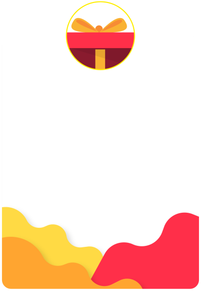
三、根据需要继承BeautifulPopupTemplate
根据需要指定弹窗的样式,例如TemplateGift继承了BeautifulPopupTemplate
重写了button、layout、等方法
import 'package:flutter/material.dart';
import 'package:flutter/cupertino.dart';
import 'Common.dart';
import '../flutter_component_beautiful_popup.dart';
/// 
class TemplateGift extends BeautifulPopupTemplate {
final BeautifulPopup options;
TemplateGift(this.options) : super(options);
@override
final illustrationPath = 'img/bg/gift.png';
@override
Color get primaryColor => options.primaryColor ?? Color(0xffFF2F49);
@override
final maxWidth = 400;
@override
final maxHeight = 580;
@override
final bodyMargin = 30;
@override
BeautifulPopupButton get button {
return ({
required String label,
required void Function() onPressed,
bool outline = false,
bool flat = false,
TextStyle labelStyle = const TextStyle(),
}) {
final gradient = LinearGradient(colors: [
primaryColor.withOpacity(0.5),
primaryColor,
]);
final double elevation = (outline || flat) ? 0 : 2;
final labelColor =
(outline || flat) ? primaryColor : Colors.white.withOpacity(0.95);
final decoration = BoxDecoration(
gradient: (outline || flat) ? null : gradient,
borderRadius: BorderRadius.all(Radius.circular(80.0)),
border: Border.all(
color: outline ? primaryColor : Colors.transparent,
width: (outline && !flat) ? 1 : 0,
),
);
final minHeight = 40.0 - (outline ? 4 : 0);
return ElevatedButton(
// color: Colors.transparent,
// elevation: elevation,
// highlightElevation: 0,
// splashColor: Colors.transparent,
child: Ink(
decoration: decoration,
child: Container(
constraints: BoxConstraints(
minWidth: 100,
minHeight: minHeight,
),
alignment: Alignment.center,
child: Text(
label,
style: TextStyle(
color: Colors.white.withOpacity(0.95),
fontWeight: FontWeight.bold,
).merge(labelStyle),
),
),
),
// padding: EdgeInsets.all(0),
// shape: RoundedRectangleBorder(
// borderRadius: BorderRadius.circular(50),
// ),
onPressed: onPressed,
);
};
}
@override
get layout {
return [
Positioned(
child: background,
),
Positioned(
top: percentH(26),
child: title,
),
Positioned(
top: percentH(36),
left: percentW(5),
right: percentW(5),
height: percentH(actions == null ? 60 : 50),
child: content,
),
Positioned(
bottom: percentW(5),
left: percentW(5),
right: percentW(5),
child: actions ?? Container(),
),
];
}
}
四、调用显示弹窗
调用显示弹窗使用的showGeneralDialog,弹出弹窗代码如下
/// `title`: Must be a `String` or `Widget`. Defaults to `''`.
  ///
  /// `content`: Must be a `String` or `Widget`. Defaults to `''`.
  ///
  /// `actions`: The set of actions that are displaed at bottom of the dialog,
  ///
  ///  Typically this is a list of [BeautifulPopup.button]. Defaults to `[]`.
  ///
  /// `barrierDismissible`: Determine whether this dialog can be dismissed. Default to `False`.
  ///
  /// `close`: Close widget.
  Future<T?> show<T>({
    dynamic title,
    dynamic content,
    List<Widget>? actions,
    bool barrierDismissible = false,
    Widget? close,
  }) {
    this.title = title;
    this.content = content;
    this.actions = actions;
    this.barrierDismissible = barrierDismissible;
    this.close = close ?? instance.close;
    final child = WillPopScope(
      onWillPop: () {
        return Future.value(barrierDismissible);
      },
      child: instance,
    );
    return showGeneralDialog<T>(
      barrierColor: Colors.black38,
      barrierDismissible: barrierDismissible,
      barrierLabel: barrierDismissible ? 'beautiful_popup' : null,
      context: context,
      pageBuilder: (context, animation1, animation2) {
        return child;
      },
      transitionDuration: Duration(milliseconds: 150),
      transitionBuilder: (ctx, a1, a2, child) {
        return Transform.scale(
          scale: a1.value,
          child: Opacity(
            opacity: a1.value,
            child: child,
          ),
        );
      },
    );
  }
这里看到源码后,觉得格式结构很好。可以参考将flutter_beautiful_popup下载后看下源码。地址:https://pub-web.flutter-io.cn/packages/flutter_beautiful_popup
五、小结
flutter开发实战-可扩展popup弹窗template模版样式
学习记录,每天不停进步。
原文地址:https://blog.csdn.net/gloryFlow/article/details/136027658
本文来自互联网用户投稿,该文观点仅代表作者本人,不代表本站立场。本站仅提供信息存储空间服务,不拥有所有权,不承担相关法律责任。
如若转载,请注明出处:http://www.7code.cn/show_66311.html
如若内容造成侵权/违法违规/事实不符,请联系代码007邮箱:suwngjj01@126.com进行投诉反馈,一经查实,立即删除!