不知道你是不是也经常听到这些话:你这个没有阴影效果;你这个阴影太浓了;你这个阴影太粗了;你这个阴影太实了;你这个阴影颜色也不对,你这个阴影…
在正式开发中,临近上线前有个环节叫UI验收(产品验收在其前后均可),主要查看开发效果与设计图是否统一,当然很多UI可能也会临时在做修改…
话回最初,在验收环节中经常会提出关于阴影的问题,可以说是不胜其烦,正好最近有一些时间,特意记录一下我已知的阴影实现
篇中的每一种效果都经过了 demo 的考验,应该总有一种能满足设计的需求
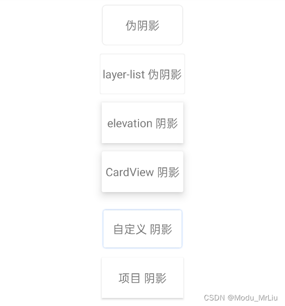
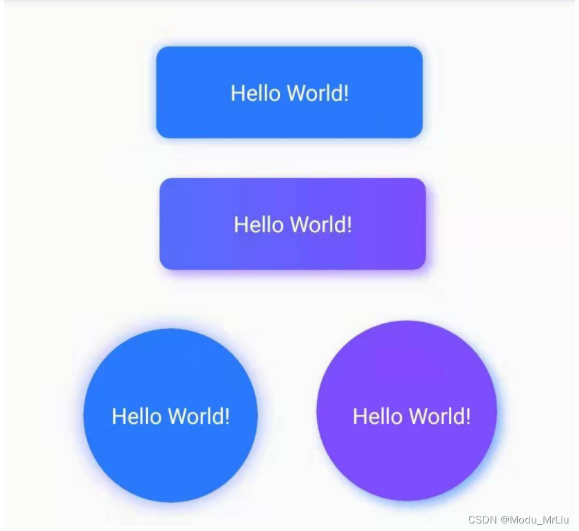
效果总览
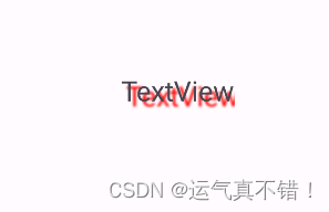
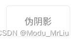
shape 伪阴影
对于shape不了解,或者不熟悉的可以直接去看 shape保姆级手册
<?xml version="1.0" encoding="utf-8"?>
<shape xmlns:android="http://schemas.android.com/apk/res/android">
    <!-- 这里是设置背景色-->
    <solid android:color="#ffffff" />
    <!-- 设置四周圆角,可统一设置,也可以单独设置某个位置为圆角-->
    <corners android:radius="5dp" />
    <!--    <corners-->
    <!--        android:bottomLeftRadius="5dp"-->
    <!--        android:bottomRightRadius="5dp"-->
    <!--        android:topLeftRadius="5dp"-->
    <!--        android:topRightRadius="5dp" />-->
    <!-- 这里设置边框 -->
    <stroke
        android:width="1dp"
        android:color="#eeeeee" />
</shape>
    <TextView
        android:layout_width="100dp"
        android:layout_height="50dp"
        android:layout_gravity="center_horizontal"
        android:layout_marginTop="10dp"
        android:background="@drawable/shape_shadow"
        android:gravity="center"
        android:text="伪阴影" />
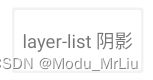
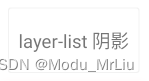
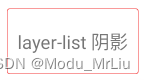
layer–list 伪阴影
采用 layer-list 的实现方式时,可以把它换位为 xml 中写控件,因为这个也是组装图层
效果
<?xml version="1.0" encoding="utf-8"?>
<layer-list xmlns:android="http://schemas.android.com/apk/res/android">
    <item>
        <shape android:shape="rectangle">
            <solid android:color="#CAEEEEEE" />
            <corners android:radius="2dp" />
        </shape>
    </item>

    <item
        android:bottom="2dp"
        android:left="2dp"
        android:right="2dp"
        android:top="2dp">
        <shape android:shape="rectangle">
            <solid android:color="@android:color/white" />
            <corners android:radius="2dp" />
        </shape>
    </item>
</layer-list>
    <TextView
        android:layout_width="100dp"
        android:layout_height="50dp"
        android:layout_gravity="center_horizontal"
        android:layout_margin="10dp"
        android:background="@drawable/layer_shadow"
        android:gravity="center"
        android:text="layer-list 阴影" />
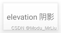
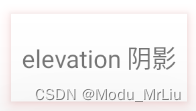
elevation 阴影
elevation是Material Design提供的一种阴影效果,只有API21及以上才支持使用;以前我没怎么用过,我写demo时尝试了一下这些属性主要作用于 ViewGroup
对于验收环节不是很严格的话,这种实现也可以过关,使用也很简单,主要用到了 elevation + translationZ + outlineSpotShadowColor 属性,未设置outlineSpotShadowColor会用系统默认灰色
效果
    <LinearLayout
        android:layout_width="wrap_content"
        android:layout_height="wrap_content"
        android:layout_gravity="center"
        android:layout_marginBottom="10dp"
        android:background="@color/white"
        android:elevation="5dp"
        android:orientation="vertical"
        android:outlineSpotShadowColor="#f00000"
        android:translationZ="1dp">

        <TextView
            android:layout_width="100dp"
            android:layout_height="50dp"
            android:layout_gravity="center_horizontal"
            android:gravity="center"
            android:text="elevation 阴影" />
    </LinearLayout>
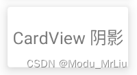
CardView 阴影
CardView是Material Design提供的一种外层(ViewGroup)控件,只有API21及以上才支持使用;内部采用的方式好像也是elevation + translationZ结合的方式
对于CardView不是太了解的话,可以去看看 CardView卡片化效果,可以快速实现圆角化、阴影等效果等
效果
    <androidx.cardview.widget.CardView xmlns:android="http://schemas.android.com/apk/res/android"
        xmlns:app="http://schemas.android.com/apk/res-auto"
        android:layout_width="wrap_content"
        android:layout_height="wrap_content"
        android:layout_gravity="center_horizontal"
        android:layout_marginBottom="10dp"
        android:background="@color/white"
        android:translationZ="3dp"
        app:cardElevation="5dp">

        <TextView
            android:layout_width="100dp"
            android:layout_height="50dp"
            android:layout_gravity="center_horizontal"
            android:gravity="center"
            android:text="CardView 阴影" />
    </androidx.cardview.widget.CardView>
.9图 阴影
设计需求来源于设计,所以也要从设计中找方案;使用.9图首先需要设计提供可用于制作.9图的原图,原图中已经实现了阴影效果,我们只要负责做.9图即可
很多设计应该并不提供.9图,所以往往需要我们 自行制作.9图 ,这里我就不去制作了,因为每个人的原图都不同,所以最好是掌握 制作.9图的方法
项目:像我项目中这样的阴影背景布局(需要设计提供一张一半高度+自带阴影的背景图),.9图可自动拉伸
自定义控件 阴影
我直接在百度找自定义阴影控件的时候,发现了github上的一个三方库,然后取了一个自定义控件类 ShadowDrawable,经测试也可以直接使用
官方效果图
package com.example.kotlindemo;

import android.graphics.Canvas;
import android.graphics.Color;
import android.graphics.ColorFilter;
import android.graphics.LinearGradient;
import android.graphics.Paint;
import android.graphics.PixelFormat;
import android.graphics.PorterDuff;
import android.graphics.PorterDuffXfermode;
import android.graphics.RectF;
import android.graphics.Shader;
import android.graphics.drawable.Drawable;
import android.view.View;

import androidx.annotation.NonNull;
import androidx.annotation.Nullable;
import androidx.core.view.ViewCompat;

public class ShadowDrawable extends Drawable {

    private Paint mShadowPaint;
    private Paint mBgPaint;
    private int mShadowRadius;
    private int mShape;
    private int mShapeRadius;
    private int mOffsetX;
    private int mOffsetY;
    private int mBgColor[];
    private RectF mRect;

    public final static int SHAPE_ROUND = 1;
    public final static int SHAPE_CIRCLE = 2;

    private ShadowDrawable(int shape, int[] bgColor, int shapeRadius, int shadowColor, int shadowRadius, int offsetX, int offsetY) {
        this.mShape = shape;
        this.mBgColor = bgColor;
        this.mShapeRadius = shapeRadius;
        this.mShadowRadius = shadowRadius;
        this.mOffsetX = offsetX;
        this.mOffsetY = offsetY;

        mShadowPaint = new Paint();
        mShadowPaint.setColor(Color.TRANSPARENT);
        mShadowPaint.setAntiAlias(true);
        mShadowPaint.setShadowLayer(shadowRadius, offsetX, offsetY, shadowColor);
        mShadowPaint.setXfermode(new PorterDuffXfermode(PorterDuff.Mode.DST_ATOP));

        mBgPaint = new Paint();
        mBgPaint.setAntiAlias(true);
    }

    @Override
    public void setBounds(int left, int top, int right, int bottom) {
        super.setBounds(left, top, right, bottom);
        mRect = new RectF(left + mShadowRadius - mOffsetX, top + mShadowRadius - mOffsetY, right - mShadowRadius - mOffsetX,
                bottom - mShadowRadius - mOffsetY);
    }

    @Override
    public void draw(@NonNull Canvas canvas) {
        if (mBgColor != null) {
            if (mBgColor.length == 1) {
                mBgPaint.setColor(mBgColor[0]);
            } else {
                mBgPaint.setShader(new LinearGradient(mRect.left, mRect.height() / 2, mRect.right,
                        mRect.height() / 2, mBgColor, null, Shader.TileMode.CLAMP));
            }
        }

        if (mShape == SHAPE_ROUND) {
            canvas.drawRoundRect(mRect, mShapeRadius, mShapeRadius, mShadowPaint);
            canvas.drawRoundRect(mRect, mShapeRadius, mShapeRadius, mBgPaint);
        } else {
            canvas.drawCircle(mRect.centerX(), mRect.centerY(), Math.min(mRect.width(), mRect.height())/ 2, mShadowPaint);
            canvas.drawCircle(mRect.centerX(), mRect.centerY(), Math.min(mRect.width(), mRect.height())/ 2, mBgPaint);
        }
    }

    @Override
    public void setAlpha(int alpha) {
        mShadowPaint.setAlpha(alpha);
    }

    @Override
    public void setColorFilter(@Nullable ColorFilter colorFilter) {
        mShadowPaint.setColorFilter(colorFilter);
    }

    @Override
    public int getOpacity() {
        return PixelFormat.TRANSLUCENT;
    }

    public static void setShadowDrawable(View view, Drawable drawable) {
        view.setLayerType(View.LAYER_TYPE_SOFTWARE, null);
        ViewCompat.setBackground(view, drawable);
    }

    /**
     * 为指定View添加阴影
     * @param view 目标View
     * @param shapeRadius View的圆角
     * @param shadowColor 阴影的颜色
     * @param shadowRadius 阴影的宽度
     * @param offsetX 阴影水平方向的偏移量
     * @param offsetY 阴影垂直方向的偏移量
     */
    public static void setShadowDrawable(View view, int shapeRadius, int shadowColor, int shadowRadius, int offsetX, int offsetY) {
        ShadowDrawable drawable = new ShadowDrawable.Builder()
                .setShapeRadius(shapeRadius)
                .setShadowColor(shadowColor)
                .setShadowRadius(shadowRadius)
                .setOffsetX(offsetX)
                .setOffsetY(offsetY)
                .builder();
        view.setLayerType(View.LAYER_TYPE_SOFTWARE, null);
        ViewCompat.setBackground(view, drawable);
    }

    /**
     * 为指定View设置带阴影的背景
     * @param view 目标View
     * @param bgColor View背景色
     * @param shapeRadius View的圆角
     * @param shadowColor 阴影的颜色
     * @param shadowRadius 阴影的宽度
     * @param offsetX 阴影水平方向的偏移量
     * @param offsetY 阴影垂直方向的偏移量
     */
    public static void setShadowDrawable(View view, int bgColor, int shapeRadius, int shadowColor, int shadowRadius, int offsetX, int offsetY) {
        ShadowDrawable drawable = new ShadowDrawable.Builder()
                .setBgColor(bgColor)
                .setShapeRadius(shapeRadius)
                .setShadowColor(shadowColor)
                .setShadowRadius(shadowRadius)
                .setOffsetX(offsetX)
                .setOffsetY(offsetY)
                .builder();
        view.setLayerType(View.LAYER_TYPE_SOFTWARE, null);
        ViewCompat.setBackground(view, drawable);
    }

    /**
     * 为指定View设置指定形状并带阴影的背景
     * @param view 目标View
     * @param shape View的形状 取值可为:GradientDrawable.RECTANGLE, GradientDrawable.OVAL, GradientDrawable.RING
     * @param bgColor View背景色
     * @param shapeRadius View的圆角
     * @param shadowColor 阴影的颜色
     * @param shadowRadius 阴影的宽度
     * @param offsetX 阴影水平方向的偏移量
     * @param offsetY 阴影垂直方向的偏移量
     */
    public static void setShadowDrawable(View view, int shape, int bgColor, int shapeRadius, int shadowColor, int shadowRadius, int offsetX, int offsetY) {
        ShadowDrawable drawable = new ShadowDrawable.Builder()
                .setShape(shape)
                .setBgColor(bgColor)
                .setShapeRadius(shapeRadius)
                .setShadowColor(shadowColor)
                .setShadowRadius(shadowRadius)
                .setOffsetX(offsetX)
                .setOffsetY(offsetY)
                .builder();
        view.setLayerType(View.LAYER_TYPE_SOFTWARE, null);
        ViewCompat.setBackground(view, drawable);
    }

    /**
     * 为指定View设置带阴影的渐变背景
     * @param view
     * @param bgColor
     * @param shapeRadius
     * @param shadowColor
     * @param shadowRadius
     * @param offsetX
     * @param offsetY
     */
    public static void setShadowDrawable(View view, int[] bgColor, int shapeRadius, int shadowColor, int shadowRadius, int offsetX, int offsetY) {
        ShadowDrawable drawable = new ShadowDrawable.Builder()
                .setBgColor(bgColor)
                .setShapeRadius(shapeRadius)
                .setShadowColor(shadowColor)
                .setShadowRadius(shadowRadius)
                .setOffsetX(offsetX)
                .setOffsetY(offsetY)
                .builder();
        view.setLayerType(View.LAYER_TYPE_SOFTWARE, null);
        ViewCompat.setBackground(view, drawable);
    }

    public static class Builder {
        private int mShape;
        private int mShapeRadius;
        private int mShadowColor;
        private int mShadowRadius;
        private int mOffsetX;
        private int mOffsetY;
        private int[] mBgColor;

        public Builder() {
            mShape = ShadowDrawable.SHAPE_ROUND;
            mShapeRadius = 12;
            mShadowColor = Color.parseColor("#4d000000");
            mShadowRadius = 18;
            mOffsetX = 0;
            mOffsetY = 0;
            mBgColor = new int[1];
            mBgColor[0] = Color.TRANSPARENT;
        }

        public Builder setShape(int mShape) {
            this.mShape = mShape;
            return this;
        }

        public Builder setShapeRadius(int ShapeRadius) {
            this.mShapeRadius = ShapeRadius;
            return this;
        }

        public Builder setShadowColor(int shadowColor) {
            this.mShadowColor = shadowColor;
            return this;
        }

        public Builder setShadowRadius(int shadowRadius) {
            this.mShadowRadius = shadowRadius;
            return this;
        }

        public Builder setOffsetX(int OffsetX) {
            this.mOffsetX = OffsetX;
            return this;
        }

        public Builder setOffsetY(int OffsetY) {
            this.mOffsetY = OffsetY;
            return this;
        }

        public Builder setBgColor(int BgColor) {
            this.mBgColor[0] = BgColor;
            return this;
        }

        public Builder setBgColor(int[] BgColor) {
            this.mBgColor = BgColor;
            return this;
        }

        public ShadowDrawable builder() {
            return new ShadowDrawable(mShape, mBgColor, mShapeRadius, mShadowColor, mShadowRadius, mOffsetX, mOffsetY);
        }
    }
}
   var testView = findViewById<TextView>(R.id.test_view)
   /* 为指定View设置带阴影的背景
   * @param view 目标View
   * @param bgColor View背景色
   * @param shapeRadius View的圆角
   * @param shadowColor 阴影的颜色
   * @param shadowRadius 阴影的宽度
   * @param offsetX 阴影水平方向的偏移量
   * @param offsetY 阴影垂直方向的偏移量
   */
   ShadowDrawable.setShadowDrawable(
       testView, Color.parseColor("#FFFFFF"), 8,
       Color.parseColor("#992979FF"), 6, 0, 0
   ); }
GradientDrawable 阴影(项目自用)
我简单的看了下,当前在项目中用的这种方式采用的是 Shape + GradientDrawable 的方式,因为是公司大佬写的,有部分源码我也还没细看,固将关键部分抽离出来,经测试后正常生效
主要分为三部分
因为具体阴影设置是在代码中统一设置,固相关效果查看总效果图即可
shape 顶层方法
package com.example.kotlindemo

import android.graphics.drawable.GradientDrawable

typealias ColorInt = Int
typealias Px = Int
typealias FloatPx = Float

internal const val NO_GETTER = "Getter not available"

inline fun shapeDrawable(fill: GradientDrawable.() -> Unit): GradientDrawable =
    GradientDrawable().also {
        it.gradientType = GradientDrawable.LINEAR_GRADIENT
        it.fill()
    }

enum class Shape {
    RECTANGLE, OVAL, LINE, RING,
}

typealias ShapeInt = Int

fun toInt(s: Shape): ShapeInt = when (s) {
    Shape.RECTANGLE -> GradientDrawable.RECTANGLE
    Shape.OVAL -> GradientDrawable.OVAL
    Shape.LINE -> GradientDrawable.LINE
    Shape.RING -> GradientDrawable.RING
}

enum class Orientation {
    TOP_BOTTOM, TR_BL, RIGHT_LEFT, BR_TL, BOTTOM_TOP, BL_TR, LEFT_RIGHT, TL_BR,
}

private fun GradientDrawable.toOrientation(orientation: Orientation): GradientDrawable.Orientation =
    when (orientation) {
        Orientation.TOP_BOTTOM -> GradientDrawable.Orientation.TOP_BOTTOM
        Orientation.TR_BL -> GradientDrawable.Orientation.TR_BL
        Orientation.RIGHT_LEFT -> GradientDrawable.Orientation.RIGHT_LEFT
        Orientation.BR_TL -> GradientDrawable.Orientation.BR_TL
        Orientation.BOTTOM_TOP -> GradientDrawable.Orientation.BOTTOM_TOP
        Orientation.BL_TR -> GradientDrawable.Orientation.BL_TR
        Orientation.LEFT_RIGHT -> GradientDrawable.Orientation.LEFT_RIGHT
        Orientation.TL_BR -> GradientDrawable.Orientation.TL_BR
    }

var GradientDrawable.shapeEnum: Shape
    set(value) {
        shape = toInt(value)
    }
    @Deprecated(message = NO_GETTER, level = DeprecationLevel.HIDDEN) get() = error(NO_GETTER)

fun rectangleGradientShape(
    radius: FloatPx = Float.NaN,
    colors: IntArray,
    orientation: Orientation,
    fill: GradientDrawable.() -> Unit = {}
): GradientDrawable =
    shapeDrawable {
        shapeEnum = Shape.RECTANGLE
        setColors(colors)
        this.orientation = toOrientation(orientation)
        // DO NOT CHANGE
        // RADIUS AND COLOR ORDER IS IMPORTANT FOR RIPPLES!
        if (!radius.isNaN()) {
            cornerRadius = radius
        }
        fill.invoke(this)
    }

fun rectangleShape(
    radius: FloatPx = Float.NaN,
    color: ColorInt,
    size: Px? = null,
    fill: GradientDrawable.() -> Unit = {}
): GradientDrawable =
    shapeDrawable {
        shapeEnum = Shape.RECTANGLE
        solidColor = color
        size?.let {
            this.size = it
        }
        // DO NOT CHANGE
        // RADIUS AND COLOR ORDER IS IMPORTANT FOR RIPPLES!
        if (!radius.isNaN()) {
            cornerRadius = radius
        }
        fill.invoke(this)
    }

fun circleShape(color: ColorInt, size: Px? = null): GradientDrawable = shapeDrawable {
    shape = GradientDrawable.OVAL
    solidColor = color
    size?.let {
        this.size = it
    }
}

var GradientDrawable.solidColor: ColorInt
    set(value) = setColor(value)
    @Deprecated(message = NO_GETTER, level = DeprecationLevel.HIDDEN) get() = error(NO_GETTER)

var GradientDrawable.size: Px
    set(value) = setSize(value, value)
    get() = intrinsicWidth

class Stroke {
    var width: Px = -1
    var color: ColorInt = -1
    var dashWidth: FloatPx = 0F
    var dashGap: FloatPx = 0F
}

inline fun GradientDrawable.stroke(fill: Stroke.() -> Unit): Stroke = Stroke().also {
    it.fill()
    setStroke(it.width, it.color, it.dashWidth, it.dashGap)
}

class Size {
    var width: Px = -1
    var height: Px = -1
}

inline fun GradientDrawable.size(fill: Size.() -> Unit): Size = Size().also {
    fill(it)
    setSize(it.width, it.height)
}

class Corners {
    var radius: FloatPx = 0F

    var topLeft: FloatPx = Float.NaN
    var topRight: FloatPx = Float.NaN
    var bottomLeft: FloatPx = Float.NaN
    var bottomRight: FloatPx = Float.NaN

    internal fun FloatPx.orRadius(): FloatPx = takeIf { it >= 0 } ?: radius
}

fun Corners.render(): FloatArray = floatArrayOf(
    topLeft.orRadius(), topLeft.orRadius(),
    topRight.orRadius(), topRight.orRadius(),
    bottomRight.orRadius(), bottomRight.orRadius(),
    bottomLeft.orRadius(), bottomLeft.orRadius()
)

inline fun GradientDrawable.corners(fill: Corners.() -> Unit): Corners = Corners().also {
    it.fill()
    cornerRadii = it.render()
}

fun GradientDrawable.corners(
    radius: FloatPx = 0f,
    topLeft: FloatPx = Float.NaN,
    topRight: FloatPx = Float.NaN,
    bottomLeft: FloatPx = Float.NaN,
    bottomRight: FloatPx = Float.NaN
): Corners = Corners().also {
    it.radius = radius
    it.topLeft = topLeft
    it.topRight = topRight
    it.bottomLeft = bottomLeft
    it.bottomRight = bottomRight
    cornerRadii = it.render()
}
package com.example.kotlindemo

import android.view.View
import androidx.core.graphics.toColorInt


fun View.warpInWhiteShadow(radius: Float = 0f, topLeft: Float = Float.NaN, topRight: Float = Float.NaN, bottomLeft: Float = Float.NaN, bottomRight: Float = Float.NaN) {
    background = rectangleShape(color = "#1AFFFFFF".toColorInt()) {
        corners(radius, topLeft, topRight, bottomLeft, bottomRight)
    }
    translationZ = 6f
}


//application的上下文,我这边demo就不复杂化了,主要是为了尺寸适配更好看一些
//inline val Int.dp: Int
//    get() = (this * AppContext.resources.displayMetrics.density + 0.5f).toInt()
//
//inline val Float.dp: Float
//    get() = (this * AppContext.resources.displayMetrics.density + 0.5f).toInt().toFloat()
使用方式
   //先设置底层的阴影背景
   var selfView = findViewById<TextView>(R.id.self_view)
   selfView.warpInWhiteShadow(topLeft = 6f, topRight = 6f)
   //再设置控件的背景
   selfView.background = rectangleShape(color = Color.WHITE) {
       corners(topLeft = 4f, topRight = 4f)
   }
xml 总览
为了防止有的朋友查看 xml 设置,特记录于此
<?xml version="1.0" encoding="utf-8"?>
<LinearLayout xmlns:android="http://schemas.android.com/apk/res/android"
    xmlns:tools="http://schemas.android.com/tools"
    android:layout_width="match_parent"
    android:layout_height="match_parent"
    xmlns:app="http://schemas.android.com/apk/res-auto"
    android:orientation="vertical">

    <TextView
        android:layout_width="100dp"
        android:layout_height="50dp"
        android:layout_gravity="center_horizontal"
        android:layout_marginTop="10dp"
        android:background="@drawable/shape_shadow"
        android:gravity="center"
        android:text="伪阴影" />

    <TextView
        android:layout_width="100dp"
        android:layout_height="50dp"
        android:layout_gravity="center_horizontal"
        android:layout_margin="10dp"
        android:background="@drawable/layer_shadow"
        android:gravity="center"
        android:text="layer-list 阴影" />

    <LinearLayout
        android:layout_width="wrap_content"
        android:layout_height="wrap_content"
        android:layout_gravity="center"
        android:layout_marginBottom="10dp"
        android:background="@color/white"
        android:elevation="5dp"
        android:orientation="vertical"
        android:translationZ="1dp">

        <TextView
            android:layout_width="100dp"
            android:layout_height="50dp"
            android:layout_gravity="center_horizontal"
            android:gravity="center"
            android:text="elevation 阴影" />
    </LinearLayout>

    <androidx.cardview.widget.CardView xmlns:android="http://schemas.android.com/apk/res/android"
        xmlns:app="http://schemas.android.com/apk/res-auto"
        android:layout_width="wrap_content"
        android:layout_height="wrap_content"
        android:layout_gravity="center_horizontal"
        android:layout_marginBottom="10dp"
        android:background="@color/white"
        android:translationZ="3dp"
        app:cardElevation="5dp">

        <TextView
            android:layout_width="100dp"
            android:layout_height="50dp"
            android:layout_gravity="center_horizontal"
            android:gravity="center"
            android:text="CardView 阴影" />
    </androidx.cardview.widget.CardView>

    <TextView
        android:id="@+id/test_view"
        android:layout_width="100dp"
        android:layout_height="50dp"
        android:layout_gravity="center_horizontal"
        android:layout_marginTop="10dp"
        android:gravity="center"
        android:text="自定义 阴影" />

    <TextView
        android:id="@+id/self_view"
        android:layout_width="100dp"
        android:layout_height="50dp"
        android:layout_gravity="center_horizontal"
        android:layout_marginTop="10dp"
        android:gravity="center"
        android:text="项目 阴影" />

</LinearLayout>
原文地址:https://blog.csdn.net/qq_20451879/article/details/131510444
本文来自互联网用户投稿,该文观点仅代表作者本人,不代表本站立场。本站仅提供信息存储空间服务,不拥有所有权,不承担相关法律责任。
如若转载,请注明出处:http://www.7code.cn/show_13781.html
如若内容造成侵权/违法违规/事实不符,请联系代码007邮箱:suwngjj01@126.com进行投诉反馈,一经查实,立即删除!