本文介绍: 引言 最近做 Dashboard大屏展示,用到了 echarts / echarts-for–react,官网文档的参考手册用过的都知道那叫一个不方便,本文整理了开发中常用的一些接口属性,有啥遗漏的地方后续会继续补充。 一、标题 title / 副标题 title: { text: ‘Echarts ‘, // 主标题名称 link: ‘https://echarts.apache.org/examples/zh/index.h…
四、锦上添花(legend,tooltip,grid,visualMap)
引言
最近做 Dashboard大屏展示,用到了 echarts / echarts-for-react,官网文档的参考手册用过的都知道那叫一个不方便,本文整理了开发中常用的一些接口属性,有啥遗漏的地方后续会继续补充。
一、标题 title / 副标题
    title: {
        text: 'Echarts ',  // 主标题名称
        link: 'https://echarts.apache.org/examples/zh/index.html', // 点击主标题跳转

        textStyle: {                  //主标题文本设置
          color: '#C28D21',           //颜色
          fontSize: 20,               //大小
          fontStyle: 'oblique',       //斜体
          fontWeight: '700',          //粗体
          fontFamily: 'monospace',    //字体
          textBorderColor: "#000",    //描边
          textBorderWidth: '1',       //描边的宽度
          textShadowColor: '#8c8c8c', //阴影颜色
          textShadowBlur: '5',        //阴影的宽度
          textShadowOffsetX: '-10',   //阴影向X偏移
          textShadowOffsetY: '30',    //阴影向Y偏移
        },


        subtext: '百度',     //副标题名称
        sublink: 'http://www.baidu.com', //副标题超链接
        subtextStyle: {//副标题的属性
          color: '#fff',
          // 其他属性类比主标题
        },


        itemGap: 3,     //主副标题间距
        x: 'center',    //主副标题的水平位置
        y: 'top',       //主副标题的垂直位置
        padding: [20, 20, 0, 20],,    //标题内边距:上右下左
        backgroundColor: '#ccc',//背景颜色;
        borderColor: '#000',    //边框的颜色
        borderWidth: 5,         //标签线框
        borderRadius: 10,       //边框切圆角
        shadowBlur: 10,         //阴影模糊大小.
        shadowColor: '#d9d9d9',    //阴影颜色
        shadowOffsetX: '40',    //阴影水平方向上的偏移距离
        shadowOffsetY: '30',    //阴影垂直方向上的偏移距离
        textAlign: 'auto',        //整体(包括 text 和 subtext)的水平对齐
        textVerticalAlign: 'auto',//整体(包括 text 和 subtext)的垂直对齐
        }
二、坐标轴(以 y 轴为例)
      yAxis: [{
        name: 'Online(vehicles)',      // y轴名称(含义/单位)
        nameLocation: 'end', // 坐标轴名称显示位置。('start''center''end')
        nameTextStyle:{                // 名称样式
          color:"#65ABE7",   // 蓝绿色
          color: '#8c8c8c',  // 会覆盖上面的颜色
          fontSize:12,
      },
    // nameGap: 15, // 坐标轴名称与轴线之间的距离。
    // nameRotate: 0, // 坐标轴名字旋转,角度值。
    // inverse: false, // 是否是反向坐标轴。
    // offset: 0, // 轴相对于默认位置的偏移,在相同的 position 上有多个 Y 轴的时候有用。
    // gridIndex: 0 , // 轴所在的 grid 的索引,默认位于第一个 grid。(一般用于多个Y轴时)
    // triggerEvent: false , // 坐标轴的标签是否响应和触发鼠标事件,默认不响应。
    // zlevel: 0 ,
    // z: 0 , //z值小的图形会被z大的图形覆盖,z相比zlevel优先级低,且不会创建新的Canvas。

        type: 'value',       // 数值轴(动态)   若为 'category'   即类别轴
        splitLine: {         // 当type:category时,该属性无效
          show: false        //  隐藏grid网格线
        },
        axisLine: {          // 轴线样式
          show: true,
          lineStyle: { color: '#d9d9d9', width: 2 }
        },
        axisTick: {
          show: false  // 此处无效,  需 type: 'category'
        },
        axisLabel: {         // 轴刻度标签(数值样式设置)
          // inside: true,      // 各数值显示在 柱状图内部
          color: '#8c8c8c'
        },
         data: [120, 132, 101, 134, 90, 230, 210]
      },
      {                        // 双y轴 配置类似上面
        show: false,
        name: 'Rate',
        type: 'value',
        splitLine: {
          show: false
        },
        axisLine: {
          show: true,
          lineStyle: { color: '#d9d9d9', width: 2 }
        },
        axisLabel: {
          // inside: true,
          color: '#8c8c8c'
        },

        // data: 数据部分在series 中设置,
        // 当type:category时,此处须设置类似: data: ['Mon', 'Tue', 'Wed', 'Thu','Sun']
}],三、series 系列(数据配置)
      series: [
        {
          name: 'Today',   // 该组数据的名称 默认会出现在提示框tooltip中
          type: 'line',    // 设置折线图类型  也可 bar pie heatmap...
          smooth: true,    // 折线设置光滑属性
          data: [120, 132, 101, 134, 90], // 数值轴的数据
          itemStyle: {                    // 设置数据样式
            normal: {
              color: '#40a9ff',
              lineStyle: {
                width: 2,
                color: '#40a9ff'
              }
            }
          },
        },
        {           // 多组数据 比如多折现图
          smooth: true,
          name: 'Rate',
          type: 'line',
          stack: 'Total',
          data:  data: [2, 2, 2, 2, 2,]

          itemStyle: {
            normal: {
              color: '#40a9ff',  // 数据点颜色
              label: {           // 给各数值设置标签
                 show: true,
                 textStyle: {    // 标签文本样式
                    color: '#fff' //白色
                 }
               },
              lineStyle: {    // 线的样式
                width: 2,
                type: 'dotted',  //'dotted'虚线,默认'solid'实线
                color: '#40a9ff'
              }
            }
          },
        },
] 为了丰富图、轴的表现形式,通常可以在 series 中设置富文本标签(label)加上 rich 属性实现,比如要实现饼图的某个类别 cityE 富文本化,呈现以下效果: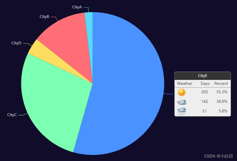
  series: [
    {
      type: 'pie',
      radius: '65%',  // 饼图占图表整个区域的比例
      center: ['50%', '50%'],  // 水平,垂直方向位置
      selectedMode: 'single',  // 表示是否支持多个类别选中  此处为单个
      data: [
        {
          value: 148,      // 富文本突出的某个数据
          name: 'CityE',   // 富文本突出的某个数据

          label: {
            formatter: [   // 自定义内容样式
              '{title|{b}}{abg|}',
              '  {weatherHead|Weather}{valueHead|Days}{rateHead|Percent}',
              '{hr|}',
              '  {Sunny|}{value|202}{rate|55.3%}',
              '  {Cloudy|}{value|142}{rate|38.9%}',
              '  {Showers|}{value|21}{rate|5.8%}'
            ].join('n'),
            backgroundColor: '#eee',
            borderColor: '#777',
            borderWidth: 1,
            borderRadius: 4,
            rich: {        // 富文本各部分属性设置
              title: {
                color: '#eee',
                align: 'center'
              },
              abg: {
                backgroundColor: '#333',
                width: '100%',
                align: 'right',
                height: 25,
                borderRadius: [4, 4, 0, 0]
              },
              Sunny: {
                height: 30,
                align: 'left',
                backgroundColor: {
                  image: weatherIcons.Sunny
                }
              },
              Cloudy: {
                height: 30,
                align: 'left',
                backgroundColor: {
                  image: weatherIcons.Cloudy
                }
              },
              Showers: {
                height: 30,
                align: 'left',
                backgroundColor: {
                  image: weatherIcons.Showers
                }
              },
              weatherHead: {
                color: '#333',
                height: 24,
                align: 'left'
              },
              hr: {
                borderColor: '#777',
                width: '100%',
                borderWidth: 0.5,
                height: 0
              },
              value: {
                color: '#333',
                width: 20,
                padding: [0, 20, 0, 45],
                align: 'center'
              },
              valueHead: {
                color: '#333',
                width: 20,
                padding: [0, 20, 0, 30],
                align: 'center'
              },
              rate: {
                color: '#333',
                width: 40,
                align: 'right',
                padding: [0, 10, 0, 0]
              },
              rateHead: {
                color: '#333',
                width: 40,
                align: 'center',
                padding: [0, 10, 0, 0]
              }
            }
          }
        },
        { value: 75, name: 'CityC' },
        { value: 10, name: 'CityD' },
        { value: 34, name: 'CityB' },
        { value: 5, name: 'CityA' }
      ],
    // 以下不是富文本的内容 一般用于鼠标 滑过/点击 饼图时出现强调效果
      emphasis: {
        itemStyle: {
          shadowBlur: 10,
          shadowOffsetX: 0,
          shadowColor: 'rgba(0, 0, 0, 0.5)'
        }
      }
    }
  ]
四、锦上添花(legend,tooltip,grid,visualMap)
4.1 图例 legend
      legend: {
        data: ['Today', 'Yesterday'],
        x: 'right',       // 调整水平位置
        y: 'center',      // 调整垂直位置
        padding: [0, 50, 50, 0],  // 设置内边距
        orient: 'vertical',       // 竖直排列方向
        icon:'circle'             // 设置图例形状
      },
4.2 提示框tooltip
      tooltip: {
        trigger: 'axis',   // 触发条件:'axis'多用于 bar line,'item'数据项触发
        axisPointer: {     // 坐标轴指示
          type: 'shadow'   // 鼠标悬浮到图上,显示阴影。
        },

        formatter: '{a} : {c}',  // 提示信息:{a}(系列名){b}(类目值){c}(数值)

        // formatter 可传入自定义函数
        formatter: function (params) {
          let s = ''
          params.forEach(item => {
            s += item.name + "</br>" + item.marker + item.seriesName + ':' + item.value
          })
          return s
        }


      },
4.3 网格 grid
      grid: {
          top: 50,   // 设置图表位置
          bottom: 50,
          left: '45%',

          width: '35%' // 设置图表宽度
          containLabel: true  // 隐藏坐标轴
      },
4.4 视觉映射
      visualMap: {
        min: 0,     // 设置数值范围
        max: 10,

        inRange: {
          color: ['#e6f7ff', '#bae7ff', '#91d5ff', '#69c0ff']  // 设置颜色类别
}五、图表实战
5.1 横向柱状图

  const getBar = () => {
    let option = {
      title: {
        text: 'Today Top Packages',
        padding: [20, 20, 0, 20],
      },
      tooltip: {
        trigger: 'axis',
        axisPointer: {
          type: 'shadow'
        },
        formatter: '{a} : {c}',
      },
      grid: {
        left: '3%',
        right: '0',
        bottom: '2%',
        // containLabel: false  // 隐藏坐标轴
      },
      xAxis: {
        name: 'Running in Vehicles',
        type: 'value',
        boundaryGap: [0, 0.01],
        show: 'true',
        axisLine: {
          // "show": false  // 隐藏线
        },
        axisTick: {
          "show": false  // 隐藏刻度
        },
        splitLine: {
          "show": false // 隐藏刻度 grid 区域中的分隔线
        }
      },
      yAxis: {
        axisLabel: {
          margin: 1,
          padding: 3,
          inside: true,
          baseline: 'bottom',
          textStyle: { // 其余属性默认使用全局文本样式,详见TEXTSTYLE
            // align: 'top',
            fontSize: 14,
            color: '#bfbfbf'
          }
        },

        type: 'category',
        data: ['aaa', 'sss', 'sda', 'ddew', 'ewedw', 'sd23', 'packages name(long)',],
        // data: bar[0],
        axisLine: {
          "show": false
        },
        axisTick: {
          "show": false
        },

      },
      series: [
        {
          barWidth: 10,
          name: 'Running in Vehicles',
          type: 'bar',
          label: {
            show: true,
            position: 'right'
          },
          // data: bar[1],
          data: [10, 52, 20, 34, 30, 38, 22],

          itemStyle: {
            normal: {
              barBorderRadius: [0, 25, 25, 0],
              color: new echarts.graphic.LinearGradient(0, 1, 0, 0, [{
                offset: 0,
                color: "#40a9ff" // 0% 处的颜色
              },
              {
                offset: 0.5,
                color: "#40a9ff" // 60% 处的颜色
              },
              {
                offset: 1,
                color: "#01ccfe", // 100% 处的颜色
                barBorderRadius: [0, 25, 25, 0],
              }], false)
            }
          },
        },
      ]
    };
    return option
  }

        <ReactEcharts
          style={{ width: '40%', boxShadow: '0 0 10px #ccc', margin: '0 0 1% 1%', }}
          option={getBar()}
          notMerge={true}
          lazyUpdate={true}
        >
        </ReactEcharts>
5.2 双向柱状图
const getBars = (title, xr, yr, xl, yl, unit, t) => {
let option = {
title: {
text: title,
padding: [20, 0, 0, 20],
},
legend: {
data: ['Download', 'Deploy'],
y: 'bottom'
},
tooltip: {
trigger: 'axis',
axisPointer: { // 坐标轴指示器,坐标轴触发有效
type: 'shadow' // 默认为直线,可选为:'line' | 'shadow'
},
formatter: function (params) {
let s = ''
params.forEach(item => {
s += item.name + "</br>" + item.marker + item.seriesName + " " + t + ' : ' + item.value + unit
})
return s
}
},
grid: [
// 右图
{
top: 50,
bottom: 50,
left: '45%',
width: '35%'
},
//左图
{
top: 50,
bottom: 50,
width: '35%'
}],
xAxis: [ //横向为x
// 右图 部署
{
name: unit,
position: 'bottom',
type: 'value',
min: 0,
// max: 100,
// splitNumber: 2,
show: 'true', // 若设置fale 下面三个无效
axisLine: {
show: true // 不写默认false
},
splitLine: {
show: false // 隐藏刻度 grid 区域中的分隔线 不写默认true
}
},
// 左图
{
name: unit,
gridIndex: 1, // grid 的索引
position: 'bottom',
type: 'value',
inverse: true, // 反转显示
min: 0,
// max: 100,
// splitNumber: 2
show: 'true', // 若设置fale 下面三个无效
axisLine: {
show: true // 不写默认false
},
splitLine: {
show: false // 隐藏刻度 grid 区域中的分隔线 不写默认true
}
}
],
yAxis: [{
// data:['a','b','c','d','e',],
data: yr,
type: 'category',
position: 'right',
show: true,
axisLine: {
show: true // 不写默认false
},
axisTick: {
show: false, // 隐藏刻度 默认为true
},
},
{
// data:['aa','ba','ca','ad','ea',],
data: yl,
gridIndex: 1,
type: 'category',
show: true, // 因为共用y轴,此处写默认为true
axisLine: {
show: true // 不写默认false
},
axisTick: {
show: false,
},
}
],
series: [{
name: 'Deploy',
type: 'bar',
label: {
normal: {
// show: true,
// position: 'right' //控制显示位置 不写默认inside
}
},
itemStyle: { color: '#1890ff' },
// data: [16, 66, 37, 53, 20, 84,],
data: xr
},
{
name: 'Download',
type: 'bar',
xAxisIndex: 1,
yAxisIndex: 1,
// stack: '总量',
label: {
normal: {
// show: true
}
},
itemStyle: { color: '#b5f5ec' },
// data: [12, 45, 100, 65, 20, 69],
data: xl
}
]
};
return option
}
<ReactEcharts
style={{ width: '100%' }}
option={
// getBars('Top AVG-Time')
getBars('Top AVG-Time', bar2[0]?.[1], bar2[0]?.[0], bar2[1]?.[1], bar2[1]?.[0], 'min', 'Time')
}
notMerge={true}
lazyUpdate={true}
>
</ReactEcharts>
// 筛选框用定位处理
<span style={{ position: 'absolute', right: '1px', top: '1px' }}>
<div>
<Select defaultValue={times2} style={{ width: 80 }} bordered={false}
getPopupContainer={(triggerNode) => triggerNode.parentNode}
onChange={(value) => {
setTimes2(value);
}}
>
<Option value="day" >&nbsp;Day &nbsp;</Option>
<Option value="week">Week</Option>
</Select>
</div>
</span>
原文地址:https://blog.csdn.net/qq_37974755/article/details/124859941
本文来自互联网用户投稿,该文观点仅代表作者本人,不代表本站立场。本站仅提供信息存储空间服务,不拥有所有权,不承担相关法律责任。
如若转载,请注明出处:http://www.7code.cn/show_27674.html
如若内容造成侵权/违法违规/事实不符,请联系代码007邮箱:suwngjj01@126.com进行投诉反馈,一经查实,立即删除!
主题授权提示:请在后台主题设置-主题授权-激活主题的正版授权,授权购买:RiTheme官网
声明:本站所有文章,如无特殊说明或标注,均为本站原创发布。任何个人或组织,在未征得本站同意时,禁止复制、盗用、采集、发布本站内容到任何网站、书籍等各类媒体平台。如若本站内容侵犯了原著者的合法权益,可联系我们进行处理。