vue3中引入echatrs详细步骤
:
【Echarts】在vue3中使用echarts绘散点图(待更新)_Morning_xx的博客-CSDN博客
vue3组件中单独引入echarts详细步骤:
【vue3】组件中使用引入echarts方法-CSDN博客
1、进入echarts官网
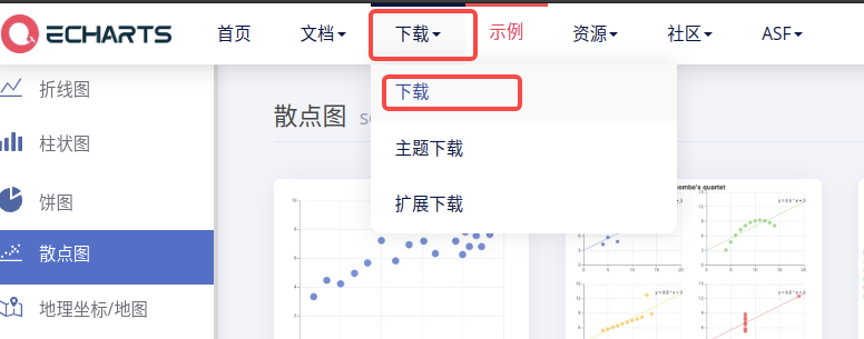
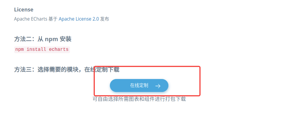
2、滑到最下面、点击【在线定制】
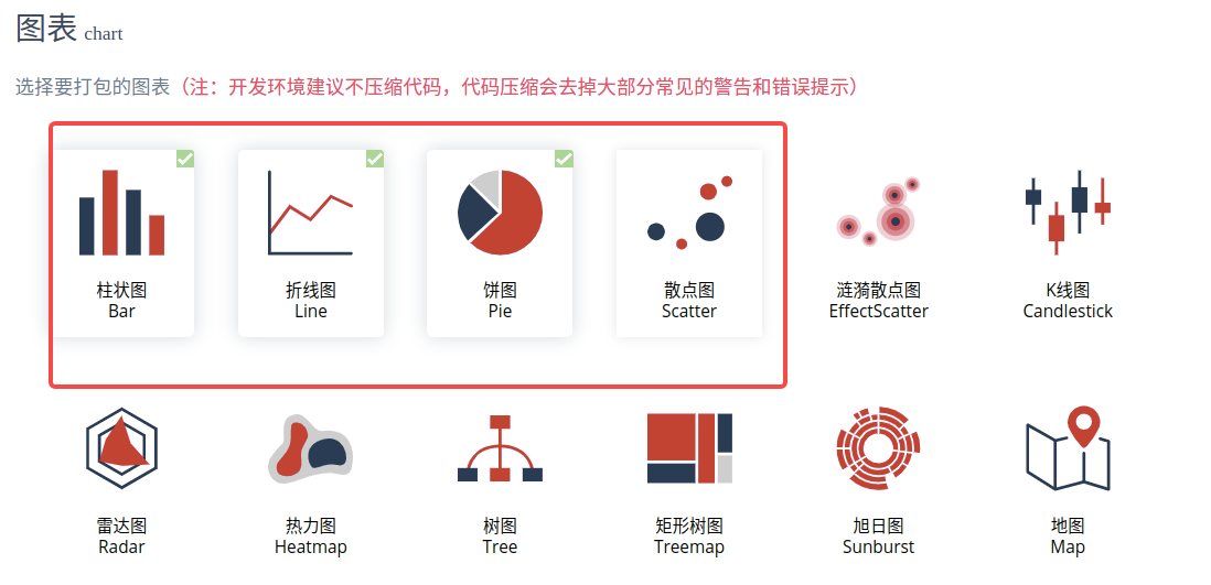
3、选择要打包的图表后,点击【下载】生成echarts.min.js文件
4、将下载后的echarts.min.js放到同级目录里面,引入html
<!DOCTYPE html>
<html>

<head>
    <meta charset="utf-8" />
    <title>ECharts</title>
    <!-- 引入刚刚下载的 echarts.min.js -->
    <script src="./echarts.min.js"></script>
</head>

<body>
    <!-- 为 ECharts 准备一个定义了宽高的 DOM -->
    <div id="main" style="width: 600px;height:400px;">
    </div>
    <script type="text/javascript">

    </script>
</body>

</html>5、到官网找一个案例,我找了一个散点图案例,下面是HTML源码
<!DOCTYPE html>
<html>
<head>
<meta charset="utf-8" />
<title>ECharts</title>
<!-- 引入刚刚下载的 ECharts 文件 -->
<script src="./echarts.min.js"></script>
</head>
<body>
<!-- 为 ECharts 准备一个定义了宽高的 DOM -->
<div id="main" style="width: 600px;height:400px;">
</div>
<script type="text/javascript">
var chartDom = document.getElementById('main');
var myChart = echarts.init(chartDom);
var option;
const dataAll = [
[
[10.0, 8.04],
[8.0, 6.95],
[13.0, 7.58],
[9.0, 8.81],
[11.0, 8.33],
[14.0, 9.96],
[6.0, 7.24],
[4.0, 4.26],
[12.0, 10.84],
[7.0, 4.82],
[5.0, 5.68]
],
[
[10.0, 9.14],
[8.0, 8.14],
[13.0, 8.74],
[9.0, 8.77],
[11.0, 9.26],
[14.0, 8.1],
[6.0, 6.13],
[4.0, 3.1],
[12.0, 9.13],
[7.0, 7.26],
[5.0, 4.74]
],
[
[10.0, 7.46],
[8.0, 6.77],
[13.0, 12.74],
[9.0, 7.11],
[11.0, 7.81],
[14.0, 8.84],
[6.0, 6.08],
[4.0, 5.39],
[12.0, 8.15],
[7.0, 6.42],
[5.0, 5.73]
],
[
[8.0, 6.58],
[8.0, 5.76],
[8.0, 7.71],
[8.0, 8.84],
[8.0, 8.47],
[8.0, 7.04],
[8.0, 5.25],
[19.0, 12.5],
[8.0, 5.56],
[8.0, 7.91],
[8.0, 6.89]
]
];
const markLineOpt = {
animation: false,
label: {
formatter: 'y = 0.5 * x + 3',
align: 'right'
},
lineStyle: {
type: 'solid'
},
tooltip: {
formatter: 'y = 0.5 * x + 3'
},
data: [
[
{
coord: [0, 3],
symbol: 'none'
},
{
coord: [20, 13],
symbol: 'none'
}
]
]
};
option = {
title: {
text: "Anscombe's quartet",
left: 'center',
top: 0
},
grid: [
{ left: '7%', top: '7%', width: '38%', height: '38%' },
{ right: '7%', top: '7%', width: '38%', height: '38%' },
{ left: '7%', bottom: '7%', width: '38%', height: '38%' },
{ right: '7%', bottom: '7%', width: '38%', height: '38%' }
],
tooltip: {
formatter: 'Group {a}: ({c})'
},
xAxis: [
{ gridIndex: 0, min: 0, max: 20 },
{ gridIndex: 1, min: 0, max: 20 },
{ gridIndex: 2, min: 0, max: 20 },
{ gridIndex: 3, min: 0, max: 20 }
],
yAxis: [
{ gridIndex: 0, min: 0, max: 15 },
{ gridIndex: 1, min: 0, max: 15 },
{ gridIndex: 2, min: 0, max: 15 },
{ gridIndex: 3, min: 0, max: 15 }
],
series: [
{
name: 'I',
type: 'scatter',
xAxisIndex: 0,
yAxisIndex: 0,
data: dataAll[0],
markLine: markLineOpt
},
{
name: 'II',
type: 'scatter',
xAxisIndex: 1,
yAxisIndex: 1,
data: dataAll[1],
markLine: markLineOpt
},
{
name: 'III',
type: 'scatter',
xAxisIndex: 2,
yAxisIndex: 2,
data: dataAll[2],
markLine: markLineOpt
},
{
name: 'IV',
type: 'scatter',
xAxisIndex: 3,
yAxisIndex: 3,
data: dataAll[3],
markLine: markLineOpt
}
]
};
option && myChart.setOption(option);
</script>
</body>
</html>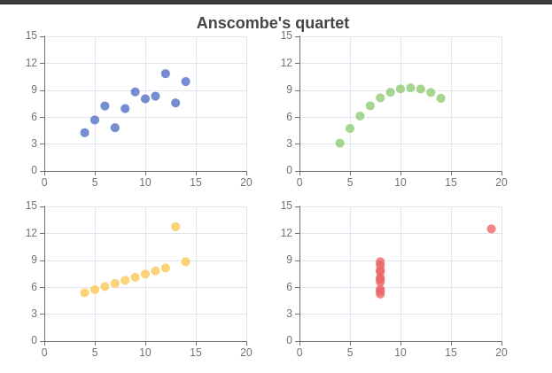
6.Echarts-基础配置
以下配置很重要:series xAxis yAxis grid tooltip title legend color
数据堆叠,同个类目轴上系列配置相同的stack值后 后一个系列的值会在前一个系列的值上相加。
如有帮助请不要吝啬你的赞哦~~~~!
原文地址:https://blog.csdn.net/m0_67986791/article/details/129383924
本文来自互联网用户投稿,该文观点仅代表作者本人,不代表本站立场。本站仅提供信息存储空间服务,不拥有所有权,不承担相关法律责任。
如若转载,请注明出处:http://www.7code.cn/show_45084.html
如若内容造成侵权/违法违规/事实不符,请联系代码007邮箱:suwngjj01@126.com进行投诉反馈,一经查实,立即删除!
声明:本站所有文章,如无特殊说明或标注,均为本站原创发布。任何个人或组织,在未征得本站同意时,禁止复制、盗用、采集、发布本站内容到任何网站、书籍等各类媒体平台。如若本站内容侵犯了原著者的合法权益,可联系我们进行处理。