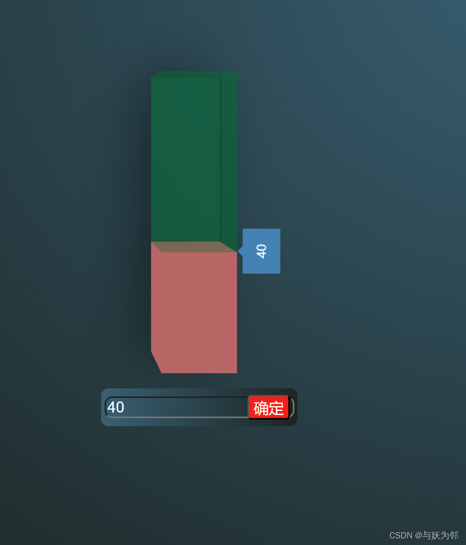
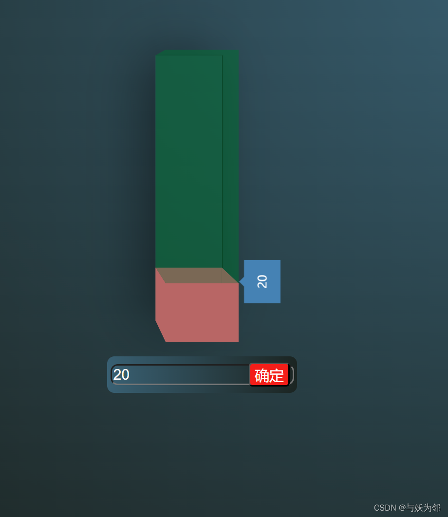
本文介绍: 【代码】HTML+CSS+JS的3D进度条。
<!DOCTYPE html>
<html lang="zh-CN">
<head>
    <meta charset="UTF-8">
    <meta name="viewport" content="width=device-width, initial-scale=1.0">
    <title>HTML+CSS+JS的3D进度条</title>
    <style>
        body {
            color: black;
            background: radial-gradient(at 60% 0%, #3a6073, #1c2522);
        }
        .input-div {
            width: 260px;
            margin: 200px 370px;
            height: 50px;
            border-radius: 10px;
            background: linear-gradient(to right, #3a6073, #1c2522);
            display: flex;
            align-items: center;
            justify-content: center;
            position: relative;
        }
        .input-div input {
            outline: none;
            background: none;
            font-size: 20px;
            color: #fff;
            border-radius: 10px;
        }
        .input-div .confirm {
            position: absolute;
            right: 10px;
            background-color: #f11818;
            color: #fff;
            border-radius: 5px;
            font-size: 20px;
            cursor: pointer;
        }
        /* ******************************************** */
        .content {
            width: 400px;
            height: 270px;
            margin: 100px;
            perspective: 1000px;
            transform-origin: 50% 50%;
            transform-style: preserve-3d;
        }
        .pro div {
            text-align: center;
            line-height: 100px;
            position: absolute;
            width: 100%;
            height: 100%;
            background-color: rgba(16, 109, 52, 0.34)
        }
        .pro {
            width: 400px;
            height: 100px;
            position: relative;
            transform-style: preserve-3d;
            transition: 0.6s;
            transform-origin: 100% 50%;
            transform: rotateZ(-90deg);
        }
        .back {
            box-shadow: 0 -16px 80px rgba(0, 0, 0, 0.463),
                0 1px 1px rgba(19, 11, 11, 0.3),
                0 1px 1px rgba(8, 1, 1, 0.829);
            transform-origin: 50% 50%;
            transform: translateZ(-100px);
        }
        .front {
            transform-origin: 50% 1000%;
            transform: translateZ(0px);
        }
        .pro div.left {
            width: 100px;
            height: 100px;
            transform-origin: 0% 100%;
            transform: rotateY(90deg);
        }
        .pro div.right {
            width: 100px;
            height: 100px;
            right: 0;
            top: 0;
            transform-origin: 100% 0%;
            transform: rotateY(-90deg);
        }
        .up {
            width: 100px;
            height: 400px;
            transform-origin: 50% 0%;
            transform: rotateX(-90deg);
        }
        .down {
            width: 100px;
            height: 400px;
            transform-origin: 50% 100%;
            transform: rotateX(90deg);
        }
        /* ************************************************************8 */
        .fill::before {
            width: 300px;
            height: 100px;
            background-color: rgba(255, 7, 7, 0.402);
            content: '';
            display: block;
            position: absolute;
            margin: 0;
            box-sizing: border-box;
            transition: all 0.5s ease-out;
        }
        .content .pro .tip {
            width: 60px;
            height: 50px;
            background-color: steelblue;
            transform: translateZ(-10px) translateY(110px);
            color: rgb(255, 255, 255);
            line-height: 50px;
            position: absolute;
            left: 270px;
            transition: all 0.5s ease-out;
        }
        .content .pro .tip::before {
            content: '';
            border-color: steelblue;
            position: absolute;
            left: 20px;
            top: -17px;
            width: 0;
            height: 0;
            border-style: solid;
            border-width: 10px;
            border-top-color: transparent;
            border-left-color: transparent;
            border-right-color: transparent;
        }
        .fill::before {
            background-color: #b76565;
            content: pointer;
        }
    </style>
</head>
<body>
    <div class="content">
        <div class="pro">
            <div class="back fill"></div>
            <div class="front fill"></div>
            <div class="left "></div>
            <div class="right"></div>
            <div class="up  fill"></div>
            <div class="down fill"></div>
            <div class="tip">
                <span>75</span>
            </div>
        </div>
    </div>
    <div class="input-div">
        <input type="text" class="per-value">
        <button class="confirm">确定</button>
    </div>
    <script>
        let btn = document.querySelector('.confirm');
        let input = document.querySelector('.per-value');
        let tip = document.querySelector('.tip');
        let tipValue = tip.children[0];
        btn.onclick = function () {
            document.styleSheets[0].addRule('.fill::before', 'width:' + input.value * 4 + 'px')
            tip.style.left = input.value * 4 - 30 + 'px';
            tipValue.innerHTML = input.value;
        }
    </script>
</body>
</html>
原文地址:https://blog.csdn.net/lulei5153/article/details/135983811
本文来自互联网用户投稿,该文观点仅代表作者本人,不代表本站立场。本站仅提供信息存储空间服务,不拥有所有权,不承担相关法律责任。
如若转载,请注明出处:http://www.7code.cn/show_64397.html
如若内容造成侵权/违法违规/事实不符,请联系代码007邮箱:suwngjj01@126.com进行投诉反馈,一经查实,立即删除!
主题授权提示:请在后台主题设置-主题授权-激活主题的正版授权,授权购买:RiTheme官网
声明:本站所有文章,如无特殊说明或标注,均为本站原创发布。任何个人或组织,在未征得本站同意时,禁止复制、盗用、采集、发布本站内容到任何网站、书籍等各类媒体平台。如若本站内容侵犯了原著者的合法权益,可联系我们进行处理。