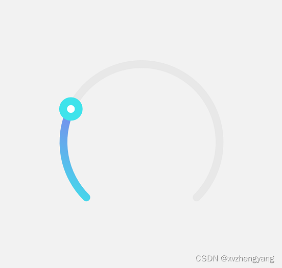
本文介绍: ReactNative实现的户型拖动进度条
我们直接看效果
先看下面的使用代码
     <CircularSlider5
          step={2}
          min={0}
          max={100}
          radius={100}
          value={30}
          onComplete={(changeValue: number) => this.handleEmailSbp(changeValue)}
          onChange={(changeValue: number) => this.handleEmailDpd(changeValue)}
          contentContainerStyle={styles.contentContainerStyle}
          strokeWidth={10}
          buttonBorderColor="#3FE3EB"
          buttonFillColor="#fff"
          buttonStrokeWidth={10}
          openingRadian={Math.PI / 4}
          buttonRadius={10}
          triangleLinerGradient={[
            {stop: '0%', color: '#FF7B4C'},
            {stop: '50%', color: '#FFFFFF'},
            {stop: '100%', color: '#317AF7'},
          ]}
          linearGradient={[
            {stop: '0%', color: '#3FE3EB'},
            {stop: '100%', color: '#7E84ED'},
          ]}></CircularSlider5>
{
radius: 100, // 半径
strokeWidth: 20, // 线宽
openingRadian: Math.PI / 4, // 开口弧度,为了便于计算值为实际开口弧度的一半
backgroundTrackColor: ‘#e8e8e8’, // 底部轨道颜色
linearGradient: [
{stop: ‘0%’, color: ‘#1890ff’},
{stop: ‘100%’, color: ‘#f5222d’},
], // 渐变色
min: 0, // 最小值
max: 100, // 最大值
buttonRadius: 12, // 按钮半径
buttonBorderColor: ‘#fff’, // 按钮边框颜色
buttonStrokeWidth: 1, // 按钮线宽
};
本组件使用到了
1.react-native-svg
2.PanResponder
具体代码如下
import React, {PureComponent} from 'react';
import Svg, {
  Path,
  G,
  Defs,
  LinearGradient,
  Stop,
  Circle,
} from 'react-native-svg';
import {StyleSheet, View, PanResponder} from 'react-native';

export default class CircularSlider extends PureComponent {
  static defaultProps = {
    radius: 100, // 半径
    strokeWidth: 20, // 线宽
    openingRadian: Math.PI / 4, // 开口弧度,为了便于计算值为实际开口弧度的一半
    backgroundTrackColor: '#e8e8e8', // 底部轨道颜色
    linearGradient: [
      {stop: '0%', color: '#1890ff'},
      {stop: '100%', color: '#f5222d'},
    ], // 渐变色
    min: 0, // 最小值
    max: 100, // 最大值
    buttonRadius: 12, // 按钮半径
    buttonBorderColor: '#fff', // 按钮边框颜色
    buttonStrokeWidth: 1, // 按钮线宽
  };

  constructor(props) {
    super(props);
    this._panResponder = PanResponder.create({
      onStartShouldSetPanResponder: () => true,
      onMoveShouldSetPanResponder: () => false,
      onPanResponderGrant: this._handlePanResponderGrant,
      onPanResponderMove: this._handlePanResponderMove,
      onPanResponderRelease: this._handlePanResponderEnd,
      onPanResponderTerminationRequest: () => false,
      onPanResponderTerminate: this._handlePanResponderEnd,
    });

    this.state = {
      value: props.value || props.min,
    };

    this._containerRef = React.createRef();
  }

  _handlePanResponderGrant = () => {
    /*
     * 记录开始滑动开始时的滑块值、弧度和坐标,用户后续值的计算
     */
    const {value} = this.state;
    this._moveStartValue = value;
    // 获取开始移动的弧度
    this._moveStartRadian = this.getRadianByValue(value);
    // 根据弧度获取开始的极坐标
    this._startCartesian = this.polarToCartesian(this._moveStartRadian);
    // console.log(`开始滑动弧度${this._startCartesian}`);
    // console.log(`开始滑动${this._startCartesian.x}:${this._startCartesian.y}`);
  };

  _handlePanResponderMove = (e, gestureState) => {
    const {min, max, step, openingRadian} = this.props;
    let {x, y} = this._startCartesian;
    x += gestureState.dx;
    y += gestureState.dy;
    // console.log(`滑动过程中${x}:${y}`);
    const radian = this.cartesianToPolar(x, y); // 当前弧度
    console.log(`滑动过程中的弧度${radian}`);
    const ratio =
      (this._moveStartRadian - radian) / ((Math.PI - openingRadian) * 2); // 弧度变化所占比例
    const diff = max - min; // 最大值和最小值的差

    let value;
    if (step) {
      value = this._moveStartValue + Math.round((ratio * diff) / step) * step;
    } else {
      value = this._moveStartValue + ratio * diff;
    }
    // 处理极值
    value = Math.max(min, Math.min(max, value));
    this.setState({
      value,
    });
    // this.setState(({value: curValue}) => {
    //   value = Math.abs(value - curValue) > diff / 4 ? curValue : value; // 避免直接从最小值变为最大值
    //   return {value: Math.round(value)};
    // });
    this._fireChangeEvent('onChange');
  };

  _handlePanResponderEnd = (e, gestureState) => {
    if (this.props.disabled) {
      return;
    }

    this._fireChangeEvent('onComplete');
  };

  _fireChangeEvent = event => {
    if (this.props[event]) {
      this.props[event](this.state.value);
    }
  };

  /**
   * 极坐标转笛卡尔坐标
   * @param {number} radian - 弧度表示的极角
   */
  polarToCartesian(radian) {
    const {radius} = this.props;
    const distance = radius + this._getExtraSize() / 2; // 圆心距离坐标轴的距离
    const x = distance + radius * Math.sin(radian);
    const y = distance + radius * Math.cos(radian);
    return {x, y};
  }

  /**
   * 笛卡尔坐标转极坐标
   * @param {*} x
   * @param {*} y
   */
  cartesianToPolar(x, y) {
    const {radius} = this.props;
    const distance = radius + this._getExtraSize() / 2; // 圆心距离坐标轴的距离
    if (x === distance) {
      return y > distance ? 0 : Math.PI / 2;
    }
    const a = Math.atan((y - distance) / (x - distance)); // 计算点与圆心连线和 x 轴的夹角
    return (x < distance ? (Math.PI * 3) / 2 : Math.PI / 2) - a;
  }

  /**
   * 获取当前弧度
   */
  getCurrentRadian() {
    return this.getRadianByValue(this.state.value);
  }

  /**
   * 根据滑块的值获取弧度
   * @param {*} value
   */
  getRadianByValue(value) {
    const {openingRadian, min, max} = this.props;
    return (
      ((Math.PI - openingRadian) * 2 * (max - value)) / (max - min) +
      openingRadian
    );
  }

  /**
   * 获取除半径外额外的大小,返回线宽和按钮直径中较大的
   */
  _getExtraSize() {
    const {strokeWidth, buttonRadius, buttonStrokeWidth} = this.props;
    return Math.max(strokeWidth, (buttonRadius + buttonStrokeWidth) * 2);
  }

  _onLayout = () => {
    const ref = this._containerRef.current;
    if (ref) {
      ref.measure((x, y, width, height, pageX, pageY) => {
        this.vertexX = pageX;
        this.vertexY = pageY;
      });
    }
  };

  render() {
    const {
      radius,
      strokeWidth,
      backgroundTrackColor,
      openingRadian,
      linearGradient,
      buttonRadius,
      buttonBorderColor,
      buttonFillColor,
      buttonStrokeWidth,
      style,
      contentContainerStyle,
      children,
    } = this.props;
    const svgSize = radius * 2 + this._getExtraSize();
    const startRadian = 2 * Math.PI - openingRadian; // 起点弧度
    const startPoint = this.polarToCartesian(startRadian);
    const endPoint = this.polarToCartesian(openingRadian);
    const currentRadian = this.getCurrentRadian(); // 当前弧度
    const curPoint = this.polarToCartesian(currentRadian);

    const contentStyle = [styles.content, contentContainerStyle];

    return (
      <View
        onLayout={this._onLayout}
        ref={this._containerRef}
        style={[styles.container, style]}>
        <Svg width={svgSize} height={svgSize}>
          <Defs>
            <LinearGradient x1="0%" y1="100%" x2="100%" y2="0%" id="gradient">
              {linearGradient.map((item, index) => (
                <Stop key={index} offset={item.stop} stopColor={item.color} />
              ))}
            </LinearGradient>
          </Defs>
          <G rotation={0} origin={`${svgSize / 2}, ${svgSize / 2}`}>
            <Path
              strokeWidth={strokeWidth}
              stroke={backgroundTrackColor}
              fill="none"
              strokeLinecap="round"
              d={`M${startPoint.x},${startPoint.y} A ${radius},${radius},0,${
                startRadian - openingRadian >= Math.PI ? '1' : '0'
              },1,${endPoint.x},${endPoint.y}`}
            />
            <Path
              strokeWidth={strokeWidth}
              stroke="url(#gradient)"
              fill="none"
              strokeLinecap="round"
              d={`M${startPoint.x},${startPoint.y} A ${radius},${radius},0,${
                startRadian - currentRadian >= Math.PI ? '1' : '0'
              },1,${curPoint.x},${curPoint.y}`}
            />
            <Circle
              cx={curPoint.x}
              cy={curPoint.y}
              r={buttonRadius}
              fill={buttonFillColor || buttonBorderColor}
              stroke={buttonBorderColor}
              strokeWidth={buttonStrokeWidth}
              {...this._panResponder.panHandlers}
            />
          </G>
        </Svg>
        <View style={contentStyle} pointerEvents="box-none">
          {children}
        </View>
      </View>
    );
  }
}

const styles = StyleSheet.create({
  container: {
    justifyContent: 'center',
    alignItems: 'center',
  },
  content: {
    position: 'absolute',
    left: 0,
    top: 0,
    bottom: 0,
    right: 0,
  },
});
原文地址:https://blog.csdn.net/xvzhengyang/article/details/136021451
本文来自互联网用户投稿,该文观点仅代表作者本人,不代表本站立场。本站仅提供信息存储空间服务,不拥有所有权,不承担相关法律责任。
如若转载,请注明出处:http://www.7code.cn/show_66445.html
如若内容造成侵权/违法违规/事实不符,请联系代码007邮箱:suwngjj01@126.com进行投诉反馈,一经查实,立即删除!
主题授权提示:请在后台主题设置-主题授权-激活主题的正版授权,授权购买:RiTheme官网
声明:本站所有文章,如无特殊说明或标注,均为本站原创发布。任何个人或组织,在未征得本站同意时,禁止复制、盗用、采集、发布本站内容到任何网站、书籍等各类媒体平台。如若本站内容侵犯了原著者的合法权益,可联系我们进行处理。


![[软件工具]文档页数统计工具软件pdf统计页数word统计页数ppt统计页数图文打印店快速报价工具](https://img-blog.csdnimg.cn/direct/09dfbaff3e9a47a9a551dd65fef5d482.jpeg)