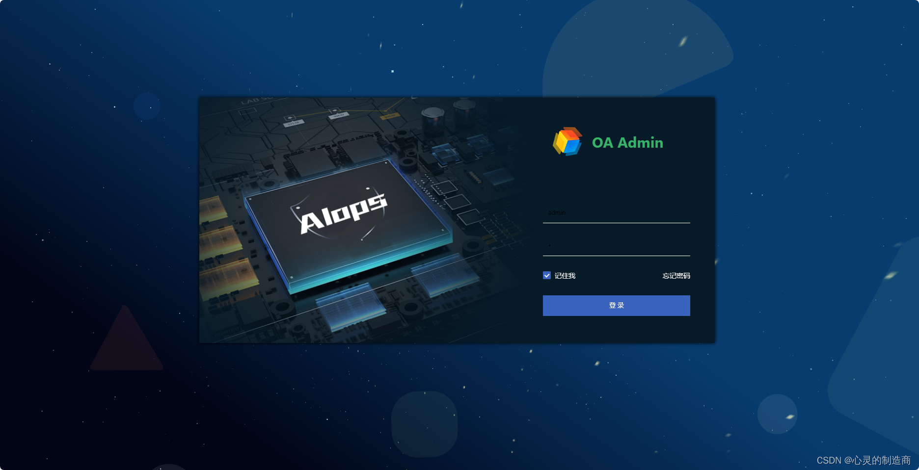
本文介绍: 效果使用了3种,分别是GIF动效、CSS3动效、2DJS动效动态元素结合,开发而成的视频视频效果。动态颗粒背景,适合做背景使用,VUE、HTML前端显示直接看效果。搞完手工,最后给大家放上个视频看看效果吧,欢迎留言交了讨论一下吧。废话不多说直接上代码;
动态颗粒背景,适合做背景使用,VUE、HTML前端显示直接看效果

废话不多说直接上代码;
一、html 代码部分
<template>
  <div id="login">
    <div class="container">
      <div class="login-form">登录表单部分</div>
      <div class="lgBGimg">
        <div class="starBgc">
          <div class="star" v-for="(item,index) in starsCount" :key="index" ref="star"></div>
        </div>
      </div>
    </div>
    <div class="cavbg">
      <canvas id="spacebg"></canvas>
    </div>
  </div>
</template>
二、脚本部分
<script>
export default {
  setup() {
    return {
      starsCount:800,//数量
      distance:600,//间距
    };
  },

  mounted() {
    const starArr=this.$refs.star
    starArr.forEach(item=>{
      let speed = 0.2+(Math.random()*1)
      let distance = this.distance+(Math.random()*300)
      item.style.transformOrigin=`0 0 ${distance}px`
      item.style.transform=`translate3d(0,0,-${distance}px) rotateY(${(Math.random()*360)}deg) rotateX(${(Math.random()*-50)}deg) scale(${speed},${speed})`
    });

    window.requestAnimFrame = (function(){
      return  window.requestAnimationFrame
    })();
    let canvas = document.getElementById("spacebg");
    let ct2d = canvas.getContext("2d");

    let numStars = 1800;
    let radius = '0.'+Math.floor(Math.random() * 9) + 1  ;
    let focalLength = canvas.width *2;
    let warp = 0;
    let centerX;
    let centerY;
    let stars = [];
    let star;
    let i;
    let animate = true;

    initializeStars();
    function executeFrame(){
      if(animate)
        requestAnimFrame(executeFrame);
	      moveStars();
	      drawStars();
    }

    function initializeStars(){
      centerX = canvas.width / 2;
      centerY = canvas.height / 2;

      stars = [];
      for(i = 0; i < numStars; i++){
        star = {
          x: Math.random() * canvas.width,
          y: Math.random() * canvas.height,
          z: Math.random() * canvas.width,
          o: '0.'+Math.floor(Math.random() * 99) + 1
        };
        stars.push(star);
      }
    }

    function moveStars(){
      for(i = 0; i < numStars; i++){
        star = stars[i];
        star.z--;
        if(star.z <= 0){
          star.z = canvas.width;
        }
      }
    }

    function drawStars(){
      var pixelX, pixelY, pixelRadius;
      if(canvas.width != window.innerWidth || canvas.width != window.innerWidth){
        canvas.width = window.innerWidth;
        canvas.height = window.innerHeight;
        initializeStars();
      }

      window.onresize = () => {
        if(canvas.width != window.innerWidth || canvas.width != window.innerWidth){
          canvas.width = window.innerWidth;
          canvas.height = window.innerHeight;
          initializeStars();
        }
      }
      if(warp==0){
        ct2d.fillStyle = "rgba(0,10,20,1)";
        // let lineGradient = ct2d.createLinearGradient (100, 10, 100, 60);//第一张图效果
        let lineGradient = ct2d.createLinearGradient (500, 50, 100, 600);//第二张图效果
        lineGradient.addColorStop(0, '#083c6f');
        lineGradient.addColorStop(1, '#010516');
        ct2d.fillStyle = lineGradient;
        ct2d.fillRect(0,0, canvas.width, canvas.height);}
        ct2d.fillStyle = "rgba(209, 255, 255, "+radius+")";
      for(i = 0; i < numStars; i++){
        star = stars[i];
        pixelX = (star.x - centerX) * (focalLength / star.z);
        pixelX += centerX;
        pixelY = (star.y - centerY) * (focalLength / star.z);
        pixelY += centerY;
        pixelRadius = 1 * (focalLength / star.z);
        ct2d.fillRect(pixelX, pixelY, pixelRadius, pixelRadius);
        ct2d.fillStyle = "rgba(209, 255, 255, "+star.o+")";
      }
    }
    executeFrame();
  }
};
</script>
三、样式部分代码
<style lang="less">
#login {
  width: 100%;
  height: 100%;
  position: relative;
  overflow: hidden;
  .container{
    width: 100%;
    height: 100%;
    position: relative;
    &:before{
      position: absolute;
      width:100%;
      height:100%;
      background:url(../../common/assets/image/background.svg);
      background-size: cover;
      opacity:0.08;
      display: block;
      content: '';
      z-index:2;
    }
  }
  .desc {
    width: 100% !important;
    text-align: center !important;
    color: gray !important;
    height: 60px !important;
    line-height: 60px !important;
  }
  .cavbg{position:absolute; left:0; top:0; z-index:0;}

  .lgBGimg{
    position: absolute;
    top:0px;
    left:0px;
    right:0px;
    bottom:0px;
    width:100%;
    height:100%;
    z-index:1;

    .starBgc{
      position: absolute;
      left:48%;
      bottom: -99px;
      transform: perspective(500px);
      transform-style: preserve-3d;
      perspective-origin: 50% 100%;
      animation: rotate 90s infinite linear;
      opacity:0.75;
      .star{
        width: 2px;
        height: 2px;
        background: #f7f7b8;
        position: absolute;
        top: 0;
        left: 0;
        backface-visibility: hidden;
      }
      @keyframes rotate {
        0%{transform: perspective(400px) rotateZ(20deg) rotateX(-40deg) rotateY(0);}
        100%{transform: perspective(400px) rotateZ(20deg) rotateX(-40deg) rotateY(-360deg);}
      }
    }
  }
}
</style>
效果使用了3种,分别是GIF动效、CSS3动效、2DJS动效动态元素结合,开发而成的视频视频效果
搞完手工,最后给大家放上个视频看看效果吧,欢迎留言交了讨论一下吧
动态颗粒元素背景
原文地址:https://blog.csdn.net/DJCBPL/article/details/136028402
本文来自互联网用户投稿,该文观点仅代表作者本人,不代表本站立场。本站仅提供信息存储空间服务,不拥有所有权,不承担相关法律责任。
如若转载,请注明出处:http://www.7code.cn/show_66947.html
如若内容造成侵权/违法违规/事实不符,请联系代码007邮箱:suwngjj01@126.com进行投诉反馈,一经查实,立即删除!
声明:本站所有文章,如无特殊说明或标注,均为本站原创发布。任何个人或组织,在未征得本站同意时,禁止复制、盗用、采集、发布本站内容到任何网站、书籍等各类媒体平台。如若本站内容侵犯了原著者的合法权益,可联系我们进行处理。