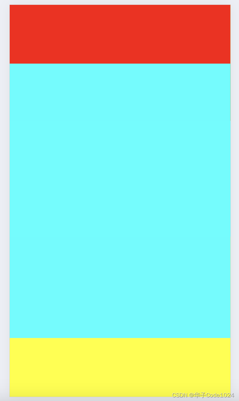
当前位置: 首页互联网正文 本文介绍: 上下固定中间自适应布局 实现上下固定中间自适应布局 1.通过position:absolute实现 定义如下结构 <body> <div class=”container”> <div class=”top”></div> <div class=”center”></div> <div class=”bottom”></div> </div> </body> style实现如下: <style> body, html { width: 100%; height: 100%; background-color: yellow; margin: 0; padding: 0; } .container { height: 100%; } .top, .bottom { width: 100%; height: 100px; background-color: red; } .bottom { background-color: green; } .center { position: absolute; width: 100%; /* height: 100%; */ /* margin-bottom: 100px; */ top: 100px; bottom: 100px; background-color: aqua; } </style> 2.通过flex布局实现,父布局高度100%,display:flex;flex-direction: column;设置纵向排列,中间设置flex:1;具体实现如下: <style> body, html { width: 100%; height: 100%; background-color: yellow; margin: 0; padding: 0; } .container { height: 100%; /* display: flex; flex-direction: column; width: 100%; */ } .top, .bottom { width: 100%; height: 100px; background-color: red; } .bottom { background-color: green; } .center { position: relative; width: 100%; /* flex: 1; */ height: 100%; /* margin-bottom: 100px; */ /* top: 100px; */ background-color: aqua; } </style> 原文地址:https://blog.csdn.net/fxh200948140216/article/details/136076311 本文来自互联网用户投稿,该文观点仅代表作者本人,不代表本站立场。本站仅提供信息存储空间服务,不拥有所有权,不承担相关法律责任。 如若转载,请注明出处:http://www.7code.cn/show_68079.html 如若内容造成侵权/违法违规/事实不符,请联系代码007邮箱:suwngjj01@126.com进行投诉反馈,一经查实,立即删除! 主题授权提示:请在后台主题设置-主题授权-激活主题的正版授权,授权购买:RiTheme官网显示所有内容声明:本站所有文章,如无特殊说明或标注,均为本站原创发布。任何个人或组织,在未征得本站同意时,禁止复制、盗用、采集、发布本站内容到任何网站、书籍等各类媒体平台。如若本站内容侵犯了原著者的合法权益,可联系我们进行处理。bodyclassdiv 代码007普通 打赏 收藏 海报 链接