本文介绍: 目录基础代码demo.htmlcss/common.cssdiv实用布局示例代码效果图table布局代码效果图flex布局代码效果图多列布局代码效果图网格布局代码效果图基础代码demo.html<!DOCTYPE html><html lang=”zh-CN”> <head> <meta charset=”utf-8″> <meta http–equiv.
基础代码
demo.html
<!DOCTYPE html>
<html lang="zh-CN">
<head>
<meta charset="utf-8">
<meta http-equiv="X-UA-Compatible" content="IE=edge">
<meta name="viewport" content="width=device-width, initial-scale=1">
<!-- 上述3个meta标签*必须*放在最前面,任何其他内容都*必须*跟随其后! -->
<title>Knote</title>
<!-- HTML5 shim 和 Respond.js 是为了让 IE8 支持 HTML5 元素和媒体查询(media queries)功能 -->
<!-- 警告:通过 file:// 协议(就是直接将 html 页面拖拽到浏览器中)访问页面时 Respond.js 不起作用 -->
<!--[if lt IE 9]>
<script src="https://cdn.jsdelivr.net/npm/html5shiv@3.7.3/dist/html5shiv.min.js"></script>
<script src="https://cdn.jsdelivr.net/npm/respond.js@1.4.2/dest/respond.min.js"></script>
<![endif]-->
<link type="text/css" rel="stylesheet" href="./css/common.css" />
<style type="text/css">
</style>
</head>
<body>
</body>
<script type="text/javascript">
</script>
</html>
css/common.css
html,
body {
	width: 100%;
	height: 100%;
	padding: 0;
	margin: 0;
	background: #fff;
	color: #000;

}

.wrapper {
	width: 100%;
	margin-bottom: 50px;
}

.clearfix:after {
	content: "";
	display: block;
	clear: both;
	height: 0;
	visibility: hidden;
}

h1,
h2,
h3,
h4{
	text-align: center;
	margin:5px 0;
	padding:0;
}

h1{
	font-size: 32px;
}
h2{
	font-size: 26px;
}
h3{
	font-size: 20px;
}
h4{
	font-size: 14px;
}div实用布局示例
代码
<div class="wrapper clearfix">
	<h2>实用布局示例</h2>
	<h3>左边固定、右边自适应</h3>
	<h4>方案一:绝对定位 + 外边距</h4>
	<style type="text/css">
		.div-e1 {
			width: 100%;
			height: 100px;
			position: relative;
		}

		.div-e1 .left {
			width: 50px;
			height: 50px;
			position: absolute;
			background: red;
		}

		.div-e1 .right {
			height: 100px;
			margin-left: 50px;
			background: blue;
		}
	</style>
	<div class="div-e1">
		<div class="left"></div>
		<div class="right"></div>
	</div>

	<h4>方案二:浮动定位。</h4>
	<style type="text/css">
		.div-e1-2 {
			width: 100%;
			height: 100px;
			position: relative;
		}

		.div-e1-2 .left {
			width: 50px;
			height: 50px;
			float:left;
			background: red;
		}

		.div-e1-2 .right {
			height: 100px;
			margin-left: 50px;
			background: blue;
		}
	</style>
	<div class="div-e1-2 clearfix">
		<div class="left"></div>
		<div class="right"></div>
	</div>

	<h3>右边固定、左边自适应</h3>
	<h4>方案一:绝对定位 + 外边距</h4>
	<style type="text/css">
		.div-e2 {
			width: 100%;
			height: 50px;
			position: relative;
		}

		.div-e2 .left {
			height: 50px;
			margin-right: 50px;
			background: blue;
		}

		.div-e2 .right {
			width: 50px;
			height: 50px;
			position: absolute;
			right: 0px;
			background: red;
		}
	</style>
	<div class="div-e2">
		<div class="right"></div>
		<div class="left"></div>
	</div>
	<p>说明:文档流中右边固定div放在左边自适应div前面,使右边固定div绝对定位时参照父元素定位,而非参照左边自适应div定位【会导致换行】。</p>

	<h3>左边固定、右边固定、中间自适应</h3>
	<h4>方案一:浮动定位 + 外边距</h4>
	<style type="text/css">
		.div-e3 {
			width: 100%;
			height: 50px;
			position: relative;
		}

		.div-e3 .left {
			width:50px;
			height: 50px;
			float:left;
			background:red;
		}

		.div-e3 .right {
			width:50px;
			height: 50px;
			float:right;
			background:blue;
		}
		.div-e3 .center {
			height: 50px;
			margin-left:50px;
			margin-right:50px;
			background:green;
		}
	</style>
	<div class="div-e3 clearfix">
		<div class="left"></div>
		<div class="right"></div>
		<div class="center"></div>
	</div>
	<p>说明:文档流中左边固定div设置向左浮动,文档流中右边固定div设置向右浮动,通过给中间部分设置左右外边距来避免重叠。</p>

	<h3>顶部固定、底部固定、中间自适应</h3>
	<h4>方案一:绝对定位</h4>
	<style type="text/css">
		.div-e4 {
			width: 100%;
			height: 360px;
			position: relative;
		}

		.div-e4 .top {
			width:100%;
			height:50px;
			position:absolute;
			top:0;
			background: red;
		}

		.div-e4 .middle {
			width:100%;
			top:50px;
			bottom:50px;
			position:absolute;
			background:green;
		}

		.div-e4 .bottom {
			width:100%;
			height:50px;
			position:absolute;
			bottom:0;
			background: blue;
		}
	</style>
	<div class="div-e4 clearfix">
		<div class="top"></div>
		<div class="middle"></div>
		<div class="bottom"></div>
	</div>

	<h4>方案二:calc函数计算</h4>
	<style type="text/css">
		.div-e4-2 {
			width: 100%;
			height: 360px;
			position: relative;
		}

		.div-e4-2 .top {
			width:100%;
			height:50px;
			background: red;
		}

		.div-e4-2 .middle {
			width:100%;
			height:calc(100% - 100px);
			background:green;
		}

		.div-e4-2 .bottom {
			width:100%;
			height:50px;
			background: blue;
		}
	</style>
	<div class="div-e4 clearfix">
		<div class="top"></div>
		<div class="middle"></div>
		<div class="bottom"></div>
	</div>

	<h3>底部栏靠底显示</h3>
	<h4>方案一:最小高度 + 绝对定位 + 内边距</h4>
	<style type="text/css">
		/* 如果是页面整体底部栏靠底显示,那么应该设置body最小高度为100%。 */
		.div-e5 {
			width: 100%;
			position: relative;
			min-height:100%;
		}

		.div-e5 .top {
			width:100%;
			height:50px;
			background: red;
		}

		.div-e5 .middle {
			width:100%;
			background:green;
			padding-bottom:50px;
			color:#fff;
		}

		.div-e5 .bottom {
			width:100%;
			height:50px;
			background: blue;
			position:absolute;
			bottom:0;
		}
	</style>
	<div class="div-e5 clearfix">
		<div class="top"></div>
		<div class="middle">
			content
		</div>
		<div class="bottom"></div>
	</div>
</div>
效果图

table布局
代码
<div class="wrapper clearfix">
	<h2>实用布局示例</h2>
	<h3>html table标签 斑马纹</h3>
	<style type="text/css">
		.table-e1 {
			width: 100%;
			height: 300px;
			margin-bottom: 36px;
			border-collapse:collapse;
		}
		.table-e1 tr{
			text-align: center;
		}
		.table-e1 tbody tr:nth-child(even){
			background:#ddd;
		}
		.table-e1 tbody tr:hover{
			background:#eee;
		}
		.table-e1 tbody tr :last-child {
			width:120px;
		}
		.table-e1 tbody tr :last-child a{
			margin:0 5px;
			cursor: pointer;
			text-decoration: none;
		}
		.table-e1 tfoot tr :first-child{
			border-right:none;
		}
		/* 等同于 .table-e1 tfoot tr td:nth-child(2) */
		.table-e1 tfoot tr :nth-child(2){
			padding-left:20px;
			text-align: left;
			border-left: none;
		}
	</style>
	<table class="table-e1" border="1" cellspacing="0" cellpadding="0" align="center">
		<caption>
			原生html表格标签布局 示例
		</caption>
		<thead>
			<tr>
				<th>id</th>
				<th>字段一</th>
				<th>字段二</th>
				<th>字段三</th>
				<th>操作选项</th>
			</tr>
		</thead>
		<tbody>
			<tr>
				<td>1001</td>
				<td>测试文本1</td>
				<td>测试文本2</td>
				<td>测试文本3</td>
				<td><a>编辑</a><a>删除</a></td>
			</tr>
			<tr>
				<td>1002</td>
				<td>测试文本1</td>
				<td>测试文本2</td>
				<td>测试文本3</td>
				<td><a>编辑</a><a>删除</a></td>
			</tr>
			<tr>
				<td>1003</td>
				<td>测试文本1</td>
				<td>测试文本2</td>
				<td>测试文本3</td>
				<td><a>编辑</a><a>删除</a></td>
			</tr>
			<tr>
				<td>1004</td>
				<td>测试文本1</td>
				<td>测试文本2</td>
				<td>测试文本3</td>
				<td><a>编辑</a><a>删除</a></td>
			</tr>
			<tr>
				<td>1005</td>
				<td>测试文本1</td>
				<td>测试文本2</td>
				<td>测试文本3</td>
				<td><a>编辑</a><a>删除</a></td>
			</tr>
			<tr>
				<td>1006</td>
				<td>测试文本1</td>
				<td>测试文本2</td>
				<td>测试文本3</td>
				<td><a>编辑</a><a>删除</a></td>
			</tr>
		</tbody>
		<tfoot>
			<tr>
				<td>信息说明</td>
				<td colspan="4">测试提示文本,提示文本,提示文本。</td>
			</tr>

		</tfoot>
	</table>

	<h3>div + css 表格 斑马纹</h3>
	<style type="text/css">
		.table-e2 {
			width: 100%;
			height: 300px;
			display:table;
			border:1px solid #333;
			box-sizing: border-box;
			border-collapse:collapse;
		}
		.table-e2 .caption{
			display:table-caption;
			width: 100%;
			text-align: center;
		}
		.table-e2 .tr{
			display:table-row;
			text-align: center;
		}
		.table-e2 .tr .cell{
			display:table-cell;
			border:1px solid #333;
			vertical-align: middle;
		}
		.table-e2 .table-header{
			display:table-header-group;
		}
		.table-header .tr{

		}
		.table-header .tr .cell{
			font-weight: bold;
		}
		.table-e2 .table-tbody{
			display:table-row-group;
		}
		.table-tbody .tr{

		}
		.table-tbody .tr:nth-child(even){
			background:#ddd;
		}
		.table-tbody .tr:hover{
			background:#eee;
		}
		.table-tbody .tr :last-child{
			width:120px;
		}
		.table-tbody .tr :last-child a{
			margin:0 5px;
			cursor:pointer;
			text-decoration:none;
		}
		.table-tbody .tr .cell{
		}
		.table-e2 .table-footer{
			display:table-footer-group;
		}
		.table-footer .tr{

		}
		.table-footer .tr .cell{
		}
		.table-footer .tr :first-child{
			border-right:none;
		}
		.table-footer .tr :nth-child(2){
			padding-left:20px;
			text-align: left;
			border-left: none;
			border-right:none;
		}
	</style>
	<div class="table-e2">
		<div class="caption">
			div + css 实现表格布局 示例
		</div>
		<div class="table-header">
			<div class="tr">
				<div class="cell">id</div>
				<div class="cell">字段一</div>
				<div class="cell">字段二</div>
				<div class="cell">字段三</div>
				<div class="cell">操作选项</div>
			</div>
		</div>
		<div class="table-tbody">
			<div class="tr">
				<div class="cell">1001</div>
				<div class="cell">测试文本1</div>
				<div class="cell">测试文本2</div>
				<div class="cell">测试文本3</div>
				<div class="cell"><a>编辑</a><a>删除</a></div>
			</div>
			<div class="tr">
				<div class="cell">1002</div>
				<div class="cell">测试文本1</div>
				<div class="cell">测试文本2</div>
				<div class="cell">测试文本3</div>
				<div class="cell"><a>编辑</a><a>删除</a></div>
			</div>
			<div class="tr">
				<div class="cell">1003</div>
				<div class="cell">测试文本1</div>
				<div class="cell">测试文本2</div>
				<div class="cell">测试文本3</div>
				<div class="cell"><a>编辑</a><a>删除</a></div>
			</div>
			<div class="tr">
				<div class="cell">1004</div>
				<div class="cell">测试文本1</div>
				<div class="cell">测试文本2</div>
				<div class="cell">测试文本3</div>
				<div class="cell"><a>编辑</a><a>删除</a></div>
			</div>
			<div class="tr">
				<div class="cell">1005</div>
				<div class="cell">测试文本1</div>
				<div class="cell">测试文本2</div>
				<div class="cell">测试文本3</div>
				<div class="cell"><a>编辑</a><a>删除</a></div>
			</div>
			<div class="tr">
				<div class="cell">1006</div>
				<div class="cell">测试文本1</div>
				<div class="cell">测试文本2</div>
				<div class="cell">测试文本3</div>
				<div class="cell"><a>编辑</a><a>删除</a></div>
			</div>
		</div>
		<div class="table-footer">
			<div class="tr">
				<div class="cell">信息说明</div>
				<div class="cell">测试提示文本,提示文本,提示文本。</div>
			</div>
		</div>
	</div>
	<p>说明:本实例并没有真正实现跨列功能。对于div表格布局,想要真正实现跨行跨列的效果,如果通过内嵌表格【display:table】的方式来实现,要注意最外层表格中一行中只有一个单元格以方便布局,否则因为display:table;布局会自动补上缺失的表格元素,导致tr中嵌套的div会被视作一个单元格,宽度受限【width:100%;也只是占据一个单元格宽度,而非占用一行宽度】。如果表格数据简单,又需要实现一些信息跨行跨列展示,那么就可以先考虑使用html table标签表格来展示数据。</p>
</div>
效果图

flex布局
代码
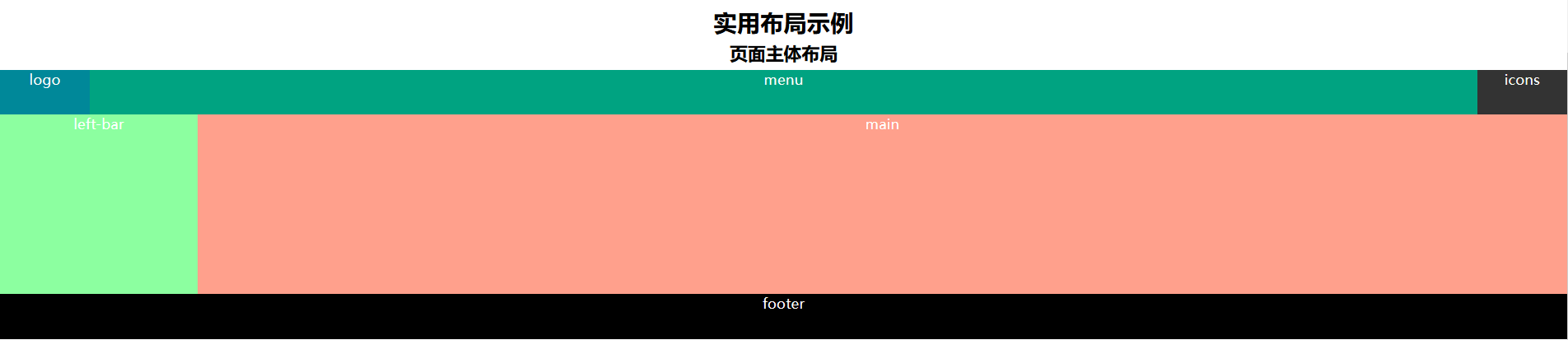
<div class="wrapper clearfix">
	<h2>实用布局示例</h2>
	<h3>页面主体布局</h3>
	<style type="text/css">
		.flex-e1 {
			width: 100%;
			height: 300px;
			display:flex;
			flex-direction: column;
			justify-content: center;
			min-width:1200px;
			background: #0000FF;
			color:#fff;
			text-align: center;
		}
		.flex-e1 .header{
			height:50px;
			display:flex;
			flex:none;
			flex-direction: row;
			background: #008000;
		}
		.flex-e1 .header .logo{
			width:100px;
			height:50px;
			flex:none;
			background: #008899;
		}
		.flex-e1 .header .menu{
			height:50px;
			flex:auto;
			background: #00A381;
		}
		.flex-e1 .header .icons{
			width:100px;
			height:50px;
			flex:none;
			background:#333333;
		}
		.flex-e1 .container{
			flex:auto;
			display:flex;
			flex-direction: row;
			background:#6B6F59;
		}
		.flex-e1 .container .left-bar{
			width:220px;
			flex:none;
			background:#8CFFA0;
		}
		.flex-e1 .container .main{
			flex:auto;
			background:#FFA08C;
		}
		.flex-e1 .footer{
			height:50px;
			flex:none;
			background:#000000;

		}

	</style>
	<div class="flex-e1">
		<div class="header">
			<div class="logo">logo</div>
			<div class="menu">menu</div>
			<div class="icons">icons</div>
		</div>
		<div class="container">
			<div class="left-bar">
				left-bar
			</div>
			<div class="main">
				main
			</div>
		</div>
		<div class="footer">
			footer
		</div>
	</div>
</div>
效果图
多列布局
代码
<div class="wrapper clearfix">
	<h2>实用布局示例</h2>
	<h3>文章多列展示</h3>
	<style type="text/css">
		.multiColumn-e1{
			width:100%;
			color:#fff;
			border:5px solid #008899;
			margin:30px 0;
			box-sizing: border-box;
		}
		.multiColumn-e1 > p{
			width:600px;
			margin:20px auto;
			color:#333;
			border:1px solid #333;
			padding:10px;
			column-count:3;
		}
		.multiColumn-e1 > p.p2{
			column-width:150px;
			column-gap:30px;
			column-rule:2px solid #008899;
		}
	</style>
	<div class="multiColumn-e1 clearfix">
		<p>测试文本1,测试文本1,测试文本1,测试文本1,测试文本1,测试文本1,测试文本1测试文本1,测试文本1测试文本1,测试文本1测试文本1,测试文本1测试文本1测试文本1,测试文本1测试文本1测试文本1,测试文本1测试文本1测试文本1测试文本1测试文本1测试文本1。</p>
		<p class="p2">测试文本2,测试文本2,测试文本2,测试文本2,测试文本2,测试文本2,测试文本2测试文本2,测试文本2测试文本2,测试文本2测试文本2,测试文本2测试文本2测试文本2,测试文本2测试文本2测试文本2,测试文本2测试文本2测试文本2测试文本2测试文本2测试文本2。</p>
	</div>

	<h3>瀑布流分列展示内容盒,内容盒不断开</h3>
	<style type="text/css">
		.multiColumn-e2{
			width:600px;
			margin:30px auto;
			color:#fff;
			border:5px solid #008899;
			box-sizing: border-box;
			column-count:3;
		}
		.multiColumn-e2 .box{
			width:160px;
			margin:0;
			padding:10px;
			break-inside: avoid;
			page-break-inside: avoid;;
		}
		.multiColumn-e2 .box p{
			margin:0;
			width:160px;
			color:#333;
			border:1px solid #333;
		}
	</style>
	<div class="multiColumn-e2 clearfix">
		<div class="box">
			<p>
				测试文本,测试文本,测试文本,测试文本。
			</p>
		</div>
		<div class="box">
			<p>
				测试文本,测试文本,测试文本,测试文本,测试文本,测试文本,测试文本。
			</p>
		</div>
		<div class="box">
			<p>
				测试文本,测试文本,测试文本,测试文本,测试文本,测试文本,测试文本,测试文本,测试文本,测试文本。
			</p>
		</div>
		<div class="box">
			<p>
				测试文本,测试文本,测试文本,测试文本,测试文本,测试文本,测试文本,测试文本,测试文本,测试文本,测试文本,测试文本,测试文本。
			</p>
		</div>
		<div class="box">
			<p>
				测试文本,测试文本,测试文本,测试文本,测试文本,测试文本,测试文本,测试文本,测试文本,测试文本,测试文本,测试文本,测试文本,测试文本,测试文本,测试文本。
			</p>
		</div>
		<div class="box">
			<p>
				测试文本,测试文本,测试文本,测试文本,测试文本,测试文本,测试文本,测试文本,测试文本,测试文本,测试文本,测试文本,测试文本,测试文本,测试文本,测试文本,测试文本,测试文本,测试文本。
			</p>
		</div>
	</div>
</div>
效果图

网格布局
代码
<div class="wrapper clearfix">
	<h2>实用布局示例</h2>
	<h3>水平、垂直居中对齐</h3>
	<style type="text/css">
		.grid-e1{
			width:300px;
			height:100px;
			position: relative;
			margin: 0 auto;
			display:grid;
			place-items:center;
			background-color: #8CFFA0;
			color:#333333;
		}
	</style>
	<div class="grid-e1">
		display:grid;
		place-items:center;
	</div>

	<h3>跨行跨列网格布局</h3>
	<style type="text/css">
		.grid-e2{
			width:900px;
			height:500px;
			position: relative;
			margin: 0 auto;
			display:grid;
			place-items:center;
			background-color: #8CFFA0;
			color:#fff;
			grid-template-columns:1fr 1fr 1fr;
			grid-template-rows:repeat(1fr,3);
			grid-template-areas:'box1 box1 box2'
								'box1 box1 box3'
								'box4 box5 box3';
			grid-gap:20px 20px;
		}
		.grid-e2 .box{
			width:100%;
			height:100%;
			display: grid;
			place-items: center;
		}
		.grid-e2 .box1{
			grid-area:box1;
			background-color: #008899;
		}
		.grid-e2 .box2{
			grid-area:box2;
			background-color: #333333;
		}
		.grid-e2 .box3{
			grid-area:box3;
			background-color: #8CA0FF;
		}
		.grid-e2 .box4{
			grid-area:box4;
			background-color: #715c1f ;
		}
		.grid-e2 .box5{
			grid-area:box5;
			background-color: #FFA08C;
		}
	</style>
	<div class="grid-e2">
		<div class="box box1"><p>box1</p></div>
		<div class="box box2"><p>box2</p></div>
		<div class="box box3"><p>box3</p></div>
		<div class="box box4"><p>box4</p></div>
		<div class="box box5"><p>box5</p></div>
	</div>
</div>
效果图

原文地址:https://blog.csdn.net/ylnzzl/article/details/124297568
本文来自互联网用户投稿,该文观点仅代表作者本人,不代表本站立场。本站仅提供信息存储空间服务,不拥有所有权,不承担相关法律责任。
如若转载,请注明出处:http://www.7code.cn/show_48878.html
如若内容造成侵权/违法违规/事实不符,请联系代码007邮箱:suwngjj01@126.com进行投诉反馈,一经查实,立即删除!
主题授权提示:请在后台主题设置-主题授权-激活主题的正版授权,授权购买:RiTheme官网
声明:本站所有文章,如无特殊说明或标注,均为本站原创发布。任何个人或组织,在未征得本站同意时,禁止复制、盗用、采集、发布本站内容到任何网站、书籍等各类媒体平台。如若本站内容侵犯了原著者的合法权益,可联系我们进行处理。