flex布局和grid布局区别
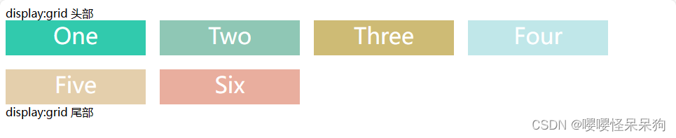
grid 布局初体验
<div class="wrapper">
<div class="one item">One</div>
<div class="two item">Two</div>
<div class="three item">Three</div>
<div class="four item">Four</div>
<div class="five item">Five</div>
<div class="six item">Six</div>
</div>
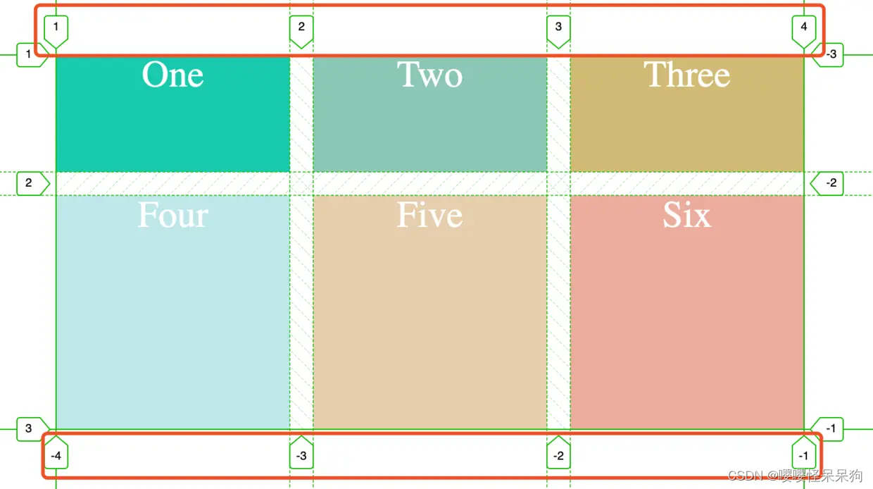
1、容器和项目
在wrapper上声明 display:grid 来创建一个网格容器,.wrapper 就是容器,每一个网格容器的子元素就是 项目
2、网格轨道
grid-template-columns 和 grid-template-rows 属性来定义网格中的行和列
3、网格单元
就是单元格
4、网格线
当我们定义网格时,我们定义的是网格轨道,而不是网格线。Grid 会为我们创建
编号的网格线来让我们来定位每一个网格元素。m 列有 m + 1 根垂直的网格线,n 行有 n + 1 跟水平网格线。比如上图示例中就有 4 根垂直网格线。一般而言,是从左到右,从上到下,1,2,3 进行编号排序。当然也可以从右到左,从下到上,按照 -1,-2,-3…顺序进行编号排序
容器属性
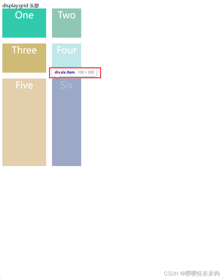
1、display 属性
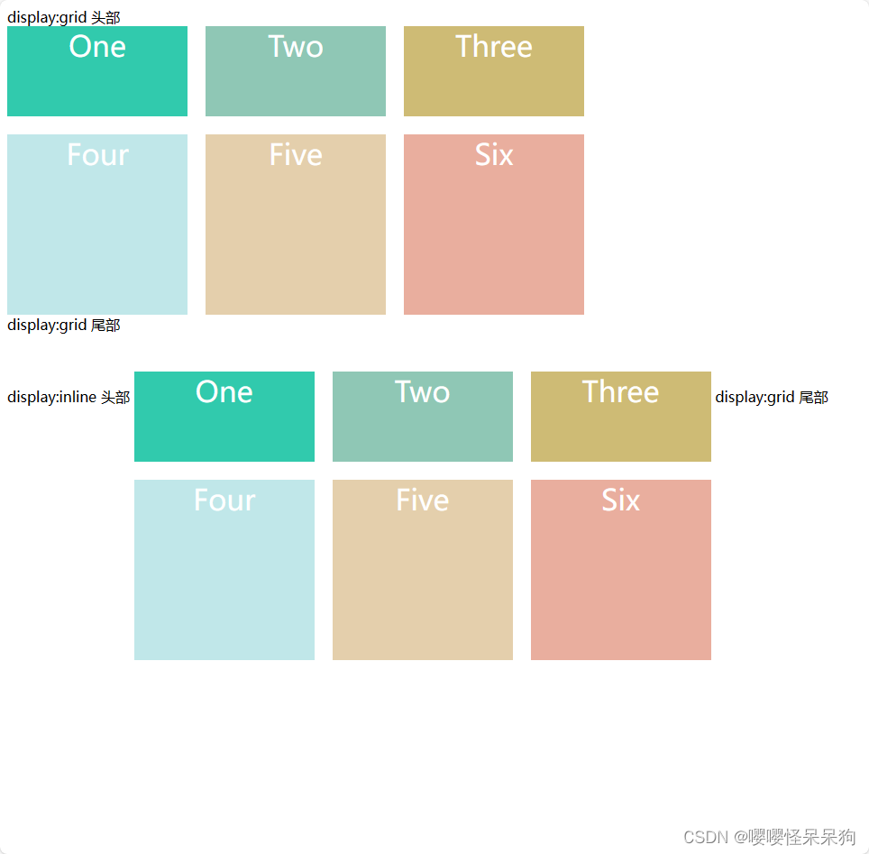
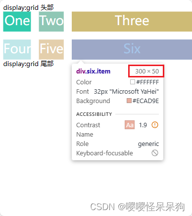
<body>
  <span>display:grid 头部</span>
  <div class="wrapper">
    <div class="one item">One</div>
    <div class="two item">Two</div>
    <div class="three item">Three</div>
    <div class="four item">Four</div>
    <div class="five item">Five</div>
    <div class="six item">Six</div>
  </div>
  <span>display:grid 尾部</span>

  </br>
  </br>
  </br>
  <span>display:inline 头部</span>

  <div class="wrapper" style="display: inline-grid;">
    <div class="one item">One</div>
    <div class="two item">Two</div>
    <div class="three item">Three</div>
    <div class="four item">Four</div>
    <div class="five item">Five</div>
    <div class="six item">Six</div>
  </div>
  <span>display:grid 尾部</span>

</body>
2、grid-template–columns 属性和 grid-template–rows 属性
    .wrapper {
      display: grid;
      grid-gap: 20px;

      /* 定义行 高度,第一行100px ,第二行200px */
      grid-template-rows: 100px 200px;
      /* 定义列 宽度,第一列100px,第二行150px,第三行200px */
      grid-template-columns: 100px 150px 200px;
    }

    .wrapper {
      display: grid;
      grid-gap: 20px;
      /* repeat 函数:该函数接受两个参数,第一个参数是重复的次数,第二个参数是所要重复的值 */
      grid-template-rows: repeat(2, 100px);
      grid-template-columns: 100px 150px 200px;
    }
    .wrapper {
      display: grid;
      grid-gap: 20px;
      grid-auto-rows: 50px;
      grid-template-columns: repeat(auto-fill, 200px);

    }
fr 关键字
fr 类似于flex 布局的 flex:1 ,把空间分成多少份
第一列宽度是200px,第二列和第三行 的宽度相加,是 剩余宽度, 第二列占剩余宽度的 1/3,第三列占剩余宽度 2/3
    .wrapper {
      display: grid;
      grid-gap: 20px;
      grid-auto-rows: 50px;
      grid-template-columns: 200px 1fr 2fr;
    }
    .wrapper {
      display: grid;
      grid-gap: 20px;
      grid-auto-rows: 50px;
      grid-template-columns: 1fr 1fr minmax(300px, 2fr);
    }
auto 关键字
    .wrapper {
      display: grid;
      grid-gap: 20px;
      grid-auto-rows: 50px;
      grid-template-columns: 300px auto
    }
3、grid-row-gap属性、grid-column-gap属性以及 grid-gap属性
grid-gap:写一个参数则是,行间距、列间距都是这个值,写两个则 第一个是行间距,第二个是列间距- 行间距:grid-row-gap 、row-gap(
这个属性支持度没有前面的好) - 列间距:grid-column-gap、column-gap(
这个属性支持度没有前面的好)
    .wrapper {
      display: grid;
      grid-gap: 20px;
      /* grid-row-gap: 20px;
      grid-column-gap: 40px; */

      /* row-gap: 30px;
      column-gap: 60px; */


      grid-template-rows: 100px 200px;
      grid-template-columns: 100px 150px 200px;

    }
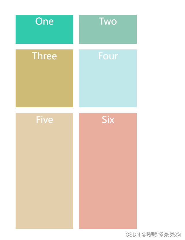
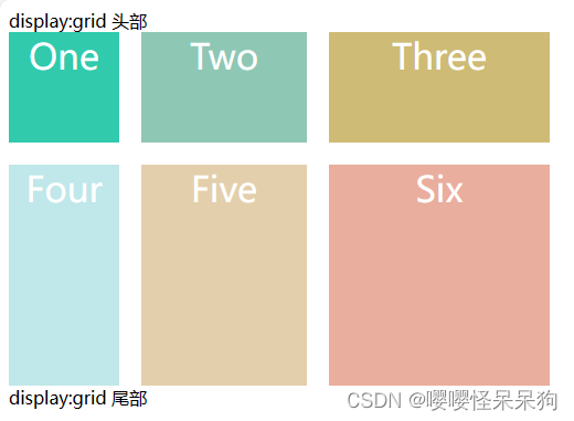
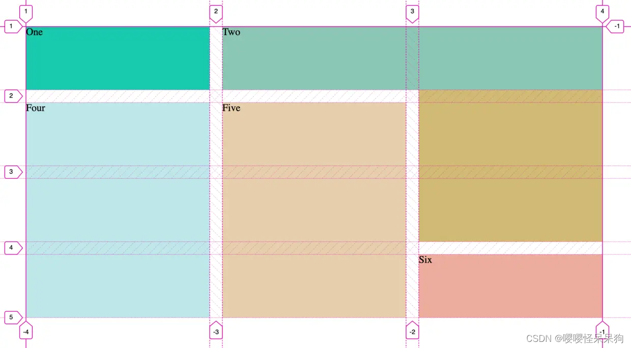
4、grid-template-areas 属性
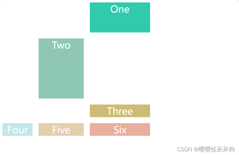
  .wrapper {
      display: grid;
      grid-gap: 20px;
      grid-template-rows: 100px 200px;
      grid-template-columns: 100px 150px 200px;
      grid-template-areas:
        ". . one"
        ". two ."
        ". . three"
        "four five six";
    }

    .one {
      background: #19CAAD;
      grid-area: one;
    }

    .two {
      background: #8CC7B5;
      grid-area: two;
    }

    .three {
      background: #D1BA74;
      grid-area: three;
    }

    .four {
      background: #BEE7E9;
      grid-area: four;
    }

    .five {
      background: #E6CEAC;
      grid-area: five;
    }

    .six {
      background: #ECAD9E;
      grid-area: six;
    }

    .item {
      text-align: center;
      font-size: 200%;
      color: #fff;
    }
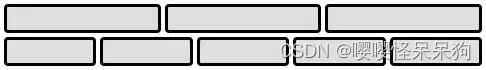
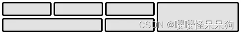
5、grid-auto-flow 属性
grid-auto-flow 属性控制着自动布局算法怎样运作,精确指定在网格中被自动布局的元素怎样排列。
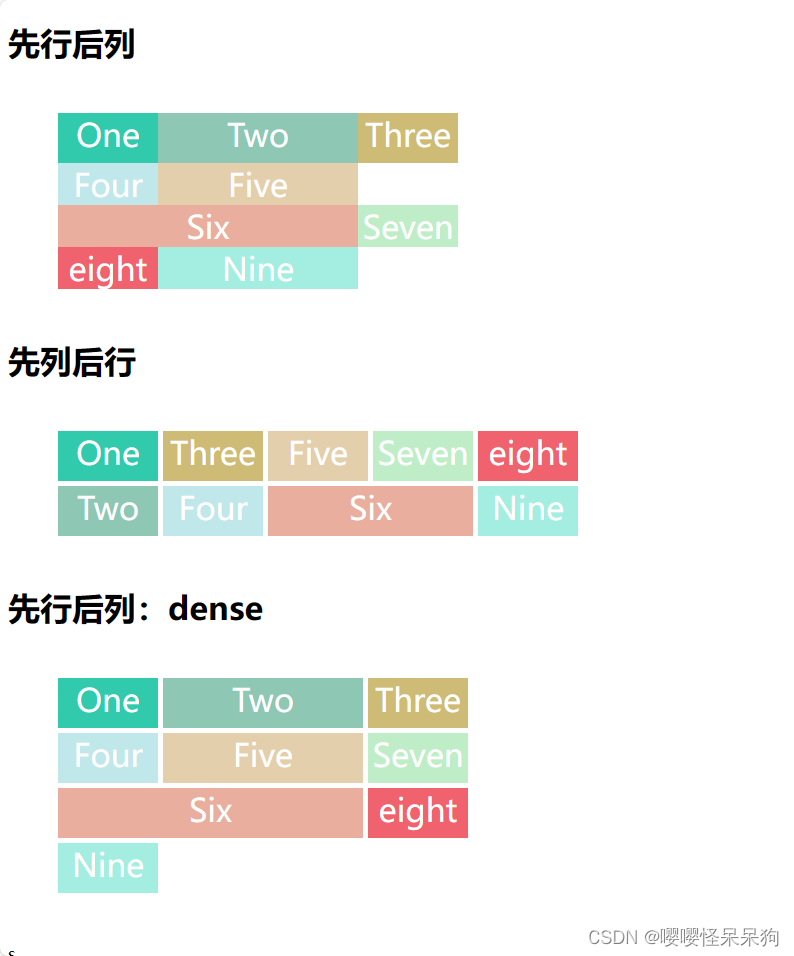
    .wrapper,
    .wrapper-1,
    .wrapper-2 {
      margin: 50px;
    }

    .wrapper {
      display: grid;
      grid-template-rows: 50px;
      grid-template-columns: 100px 200px 100px;
      grid-auto-flow: row;
      /* grid-gap: 5px; */
    }

    .wrapper-1 {
      display: grid;
      grid-auto-columns: 100px;
      grid-auto-flow: column;
      grid-gap: 5px;
      grid-template-rows: 50px 50px;
    }

    .wrapper-2 {
      display: grid;
      grid-template-columns: 100px 200px 100px;
      grid-auto-flow: row dense;
      grid-gap: 5px;
      grid-auto-rows: 50px;
    }

    .one {
      background: #19CAAD;
    }

    .two {
      background: #8CC7B5;
    }

    .three {
      background: #D1BA74;
    }

    .four {
      background: #BEE7E9;
    }

    .five {
      background: #E6CEAC;
    }

    .six {
      /* grid-column-start: span 2; */

      /* grid-column: auto; */
      grid-column: span 2; /* 这个意思是占据两个单元格*/
      background: #ECAD9E;
    }

    .seven {
      background: #BEEDC7;
    }

    .eight {
      background: #F4606C;
    }

    .nine {
      background: #A0EEE1;
    }

    .item {
      text-align: center;
      font-size: 200%;
      color: #fff;
    }
  <h1>先行后列</h1>
  <div class="wrapper">
    <div class="one item">One</div>
    <div class="two item">Two</div>
    <div class="three item">Three</div>
    <div class="four item">Four</div>
    <div class="five item">Five</div>
    <div class="six item">Six</div>
    <div class="seven item">Seven</div>
    <div class="eight item">eight</div>
    <div class="nine item">Nine</div>
  </div>

  <h1>先列后行</h1>
  <div class="wrapper-1">
    <div class="one item">One</div>
    <div class="two item">Two</div>
    <div class="three item">Three</div>
    <div class="four item">Four</div>
    <div class="five item">Five</div>
    <div class="six item">Six</div>
    <div class="seven item">Seven</div>
    <div class="eight item">eight</div>
    <div class="nine item">Nine</div>
  </div>

  <h1>先行后列:dense</h1>
  <div class="wrapper-2">
    <div class="one item">One</div>
    <div class="two item">Two</div>
    <div class="three item">Three</div>
    <div class="four item">Four</div>
    <div class="five item">Five</div>
    <div class="six item">Six</div>
    <div class="seven item">Seven</div>
    <div class="eight item">eight</div>
    <div class="nine item">Nine</div>
  </div>
6、justify-items 属性、align-items 属性
.container {
  justify-items: start | end | center | stretch;
  align-items: start | end | center | stretch;
}
justify-items: center;
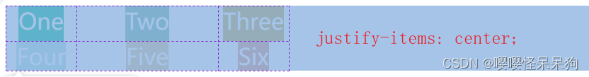
justify-items:start;

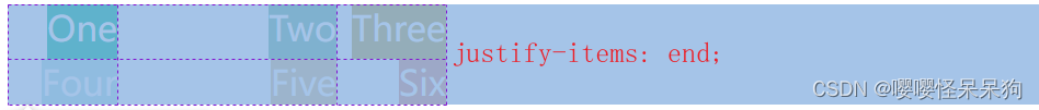
justify-items:end;
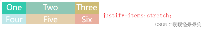
justify-items:stretch;
拉伸,铺满
7、justify–content 属性、align–content 属性以及 place–content 属性
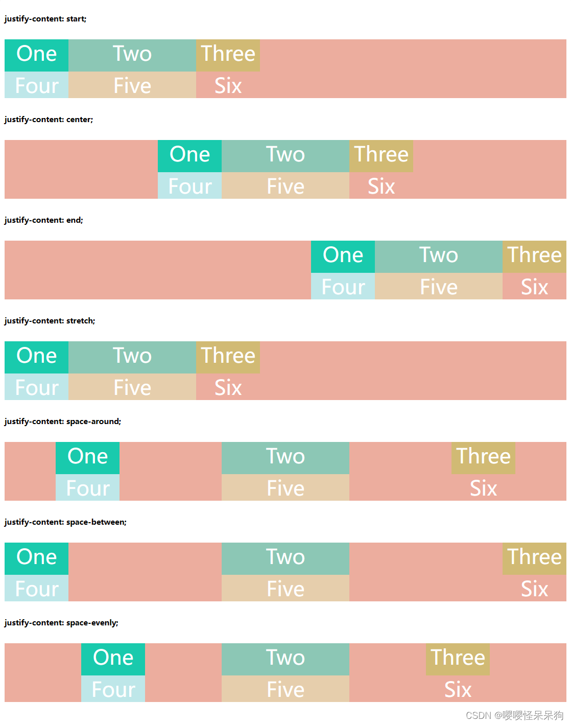
  justify-content: start | end | center | stretch | space-around | space-between | space-evenly;
  align-content: start | end | center | stretch | space-around | space-between | space-evenly;
- start:将网格对齐到 网格容器(grid container) 的左侧起始边缘(左侧对齐)
- end:将网格对齐到 网格容器 的右侧结束边缘(右侧对齐)
- center:将网格对齐到 网格容器 的水平中间位置(水平居中对齐)
- stretch:调整 网格项(grid items) 的宽度,允许该网格填充满整个 网格容器 的宽度
- space-around:在每个网格项之间放置一个均匀的空间,左右两端放置一半的空间
- space-between:在每个网格项之间放置一个均匀的空间,左右两端没有空间
- space-evenly:项目与项目的间隔相等,项目与容器边框之间也是同样长度的间隔
8、grid-auto-columns 属性和 grid-auto-rows 属性
显式网格包含了你在 grid-template-columns 和 grid-template-rows 属性中定义的行和列。如果你在网格定义之外又放了一些东西,或者因为内容的数量而需要的更多网格轨道的时候,网格将会在隐式网格中创建行和列
如果有隐式网格它的行高和列宽可以根据 grid-auto-columns 属性和 grid-auto-rows属性设置
    .wrapper {
      display: grid;
      grid-template-columns: 150px 100px;
      grid-gap: 20px;
      grid-template-rows: 100px 100px;

      grid-auto-rows: 300px;
      /* grid-auto-columns: 200px; */
    }
项目属性
1、grid-column-start 属性、grid-column-end 属性、grid-row-start 属性以及grid-row-end 属性
grid-column CSS 属性是 grid-column-start (en-US) 和 grid-column-end (en-US) 的简写属性
grid-row 属性是一种 grid-row-start (en-US) 和 grid-row-end (en-US) 的缩写(shorthand)形式
具体可参考MDN MDN grid-row
- grid-column-start 属性:左边框所在的垂直网格线
- grid-column-end 属性:右边框所在的垂直网格线
- grid-row-start 属性:上边框所在的水平网格线
- grid-row-end 属性:下边框所在的水平网格线
    .wrapper {
      display: grid;
      grid-template-columns: repeat(3, 1fr);
      grid-gap: 20px;
      grid-auto-rows: minmax(100px, auto);
    }

    .one {
      /* grid-column-start: 1;
      grid-column-end: 2; */
      background: #19CAAD;
    }

    .two {
      grid-column-start: 2;
      grid-column-end: 4;
      grid-row-start: 1;
      grid-row-end: 2;
      /*   如果有重叠,就使用 z-index */
      z-index: 1;
      background: #8CC7B5;
    }

    .three {
      /* grid-column-start: 3;
      grid-column-end: 4; */
      /* grid-row-start: 1;
      grid-row-end: 4; */

      grid-column: 3 / 4;
      grid-row: 1 / 4;
      background: #D1BA74;
      z-index: 2;
    }

    .four {
      grid-column-start: 1;
      grid-column-end: 2;
      grid-row-start: 2;
      grid-row-end: 5;
      background: #BEE7E9;
    }

    .five {
      grid-column-start: 2;
      grid-column-end: 2;
      grid-row-start: 2;
      grid-row-end: 5;
      background: #E6CEAC;
    }

    .six {
      grid-column: 3;
      grid-row: 4;
      background: #ECAD9E;
    }
原文地址:https://blog.csdn.net/qq_45634593/article/details/134729109
本文来自互联网用户投稿,该文观点仅代表作者本人,不代表本站立场。本站仅提供信息存储空间服务,不拥有所有权,不承担相关法律责任。
如若转载,请注明出处:http://www.7code.cn/show_29936.html
如若内容造成侵权/违法违规/事实不符,请联系代码007邮箱:suwngjj01@126.com进行投诉反馈,一经查实,立即删除!