本文介绍: 用css实现一个小清新的动态毛玻璃背景效果。
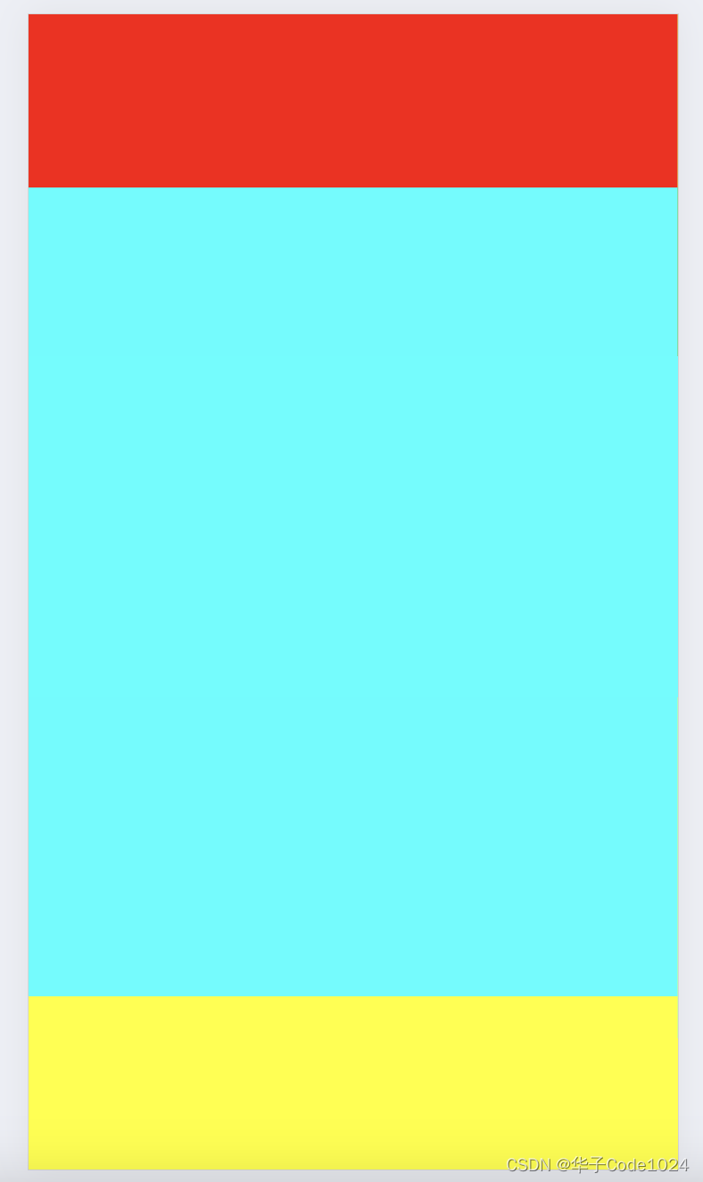
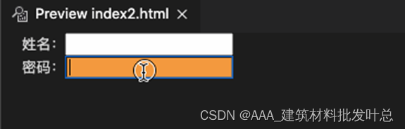
页面效果

此效果可适用于登录窗口,网站背景或者一些卡片列表中,使网页更具科技感和空间感。
核心代码部分,简要说明了写法思路;完整代码在最后,可直接复制到本地运行。
核心代码
html代码
css代码
圆形部分主要样式
使用 backdrop-filter 属性模拟毛玻璃效果
用 backdrop-filter 属性中的 blur 参数来模拟毛玻璃效果,数值越大,模糊效果越重,可适当调试参数,直到你喜欢为止。
完整代码
html页面
css样式
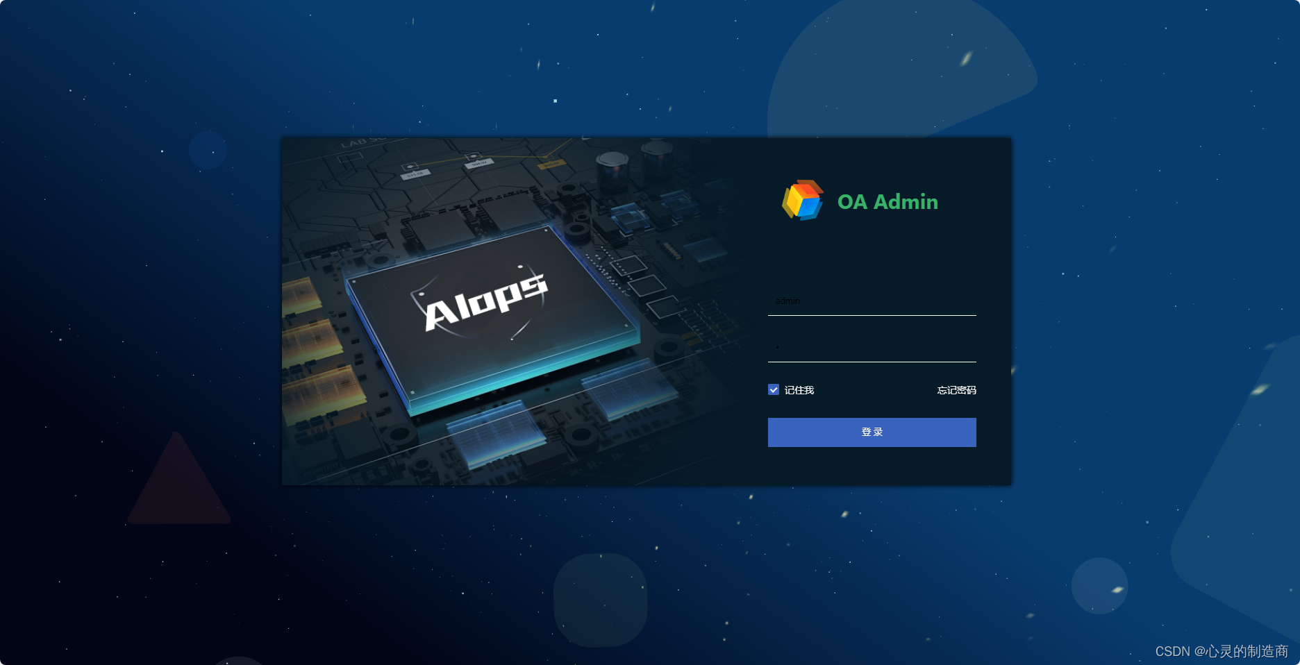
页面效果
声明:本站所有文章,如无特殊说明或标注,均为本站原创发布。任何个人或组织,在未征得本站同意时,禁止复制、盗用、采集、发布本站内容到任何网站、书籍等各类媒体平台。如若本站内容侵犯了原著者的合法权益,可联系我们进行处理。